But even beyond that, I don’t do the rattle can thing of finger off trigger after a pass. Air is always flowing, it’s just forward and backward to control the flow. It took me a little time to get used to it; forward-backward instead of up-down. But now I get confused by spray cans…
2 Likes
Progress update. Not much, really. Plodding along. It’s a journey, not a race, right?
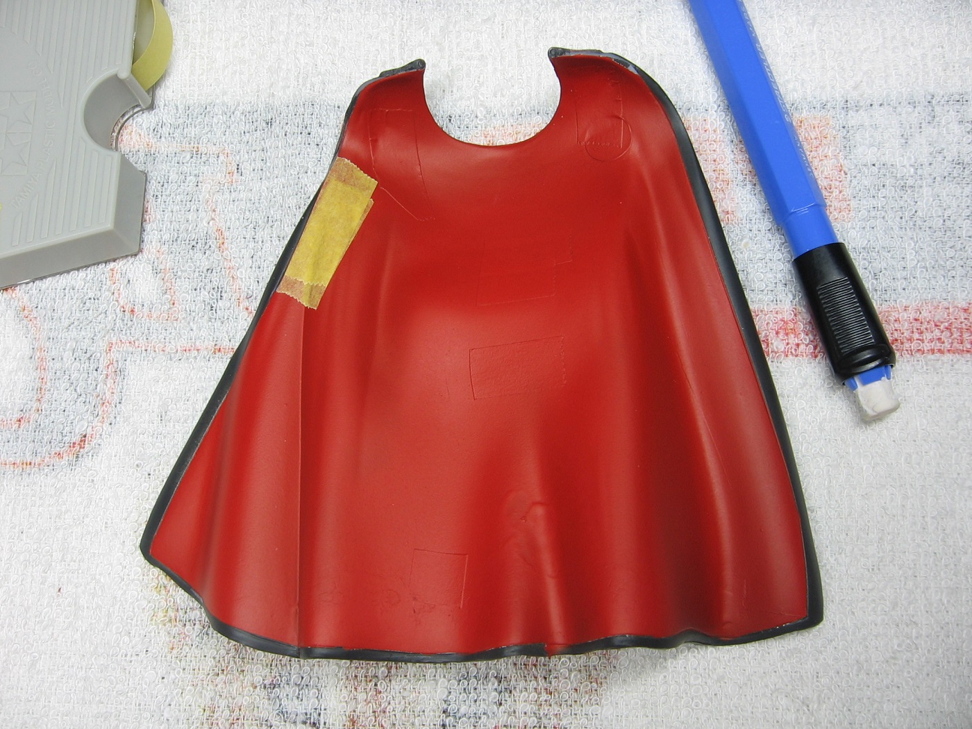
Got some red on the inside of the cape a couple days ago.
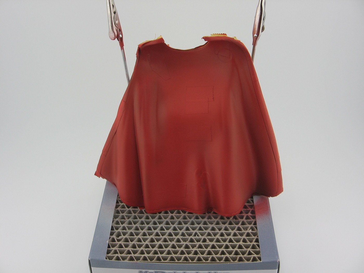
Vallejo Model Air 71.003 Red, mixed 75% paint, 20% Airbrush Thinner, 5% Flow Improver. The blotch just right of center is the result of trying to remove something (speck of dust?) with a cotton swab. Should have left well enough alone, as the result is worse than the original problem. At any rate, I figure this will be hidden by the body and won’t be visible.
I’m not sure if my pre-shading worked out or or not. It doesn’t really show in this picture, but it is slightly visible on the bench. I suppose one trick to pre-shading is avoiding the OCD vibes to keep laying down the base color until the pre-shading is no longer visible. This is what I was inclined to do. Feedback/critique is most welcome on this.
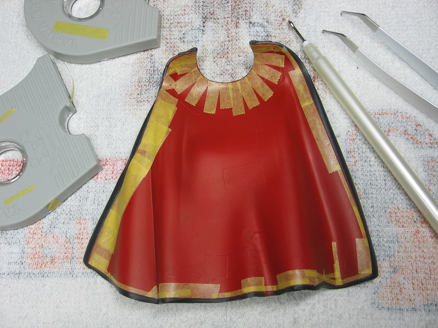
I intend to try my hand at some post shading for the inside of the cape as well. Still researching that, including the so called Vallejo BSL Painting System. I think I’ll start a separate thread regarding that.
Other than that, I have been working on getting the smaller parts painted up by hand.
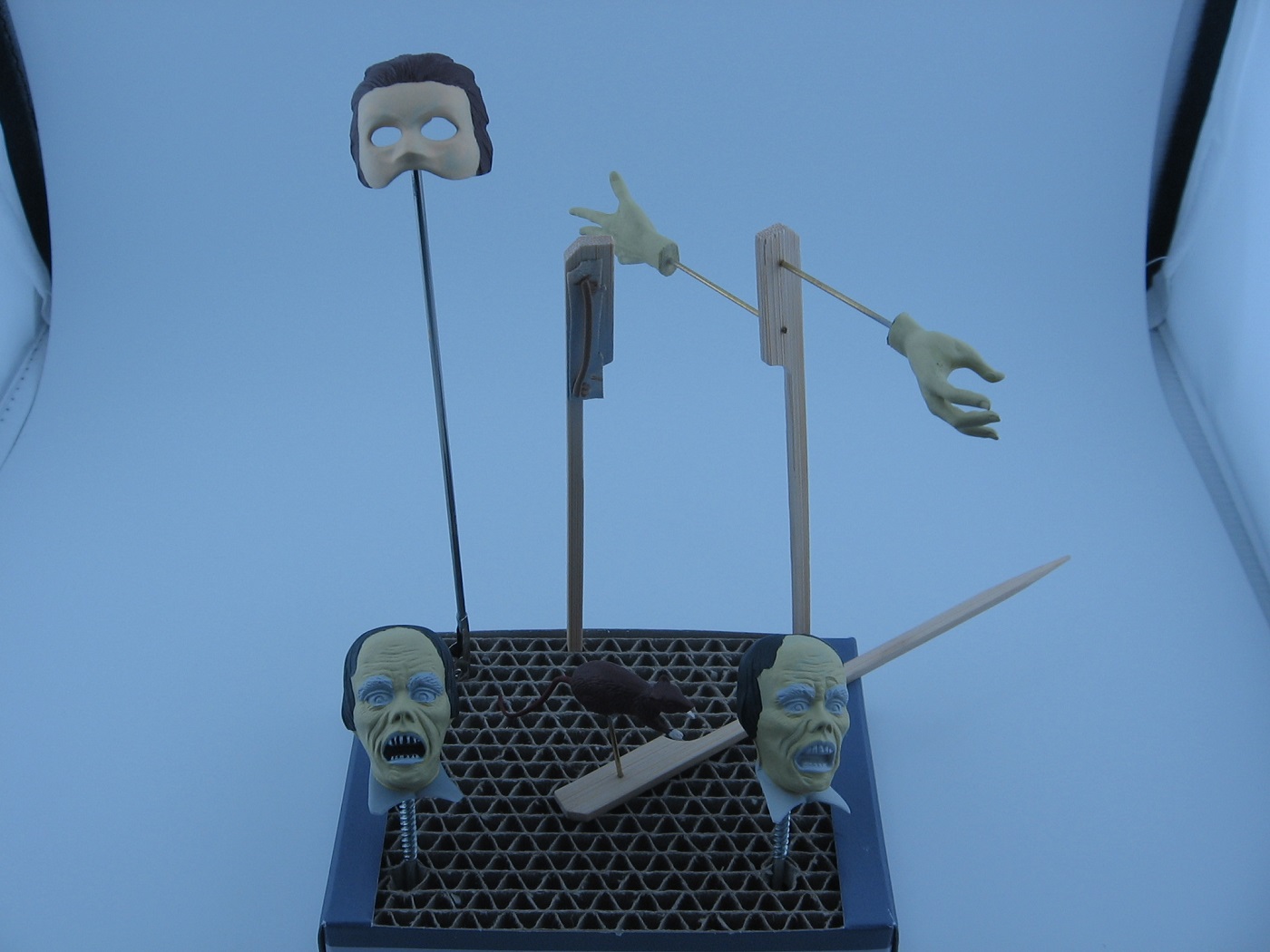
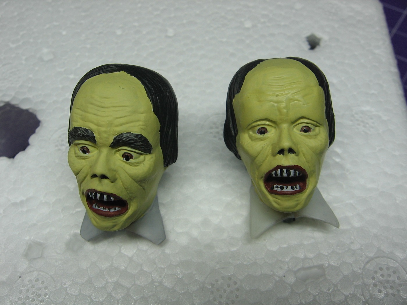
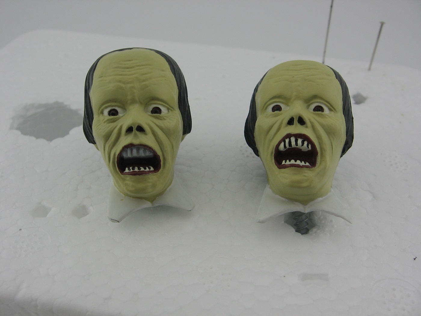
Please excuse the bluish light. With the new light box I just got, the jaundice face shows most accurately with my camera’s white balance set for tungsten lighting. Obviously, these are still works in progress.
The rope tie for the cape is complete.
The rat is mostly complete. Hard to tell in the photo, but the tail, ears and nose are a different brown than the body. Just have to touch up a holiday on the nose and that will be done.
The hands are done, except for a wash.
At least one more coat required on the mask.
The head on the left is the one I’ll be using. The head on the right I’m using as a mule. I’m happy with the base color for the face. I’ll be going with that. Somehow, I missed airbrushing primer on the shirt lapels of the right head.
Thanks for looking. Feedback/critique is welcome.
Cheers,
Mark
6 Likes
That cape looks great!! I can see the shading from here. Knowing how much base color to lay over a pre shaded surface is very difficult and I struggle with it constantly. The good news is there’s always post shading!
As for the white balance/bluish color issue, can you set the white balance manually in your camera? If so, find some object that’s as neutral of a grey as possible, not warm or cool (yellow or blue), and then set the white balance based on that. They sell “white balance cards” that are a true neutral grey just for this. You take a pic of it and the tell your camera that that color is neutral, and everything else references off of that, and then the color of your lighting doesn’t matter.
In short, a quick google for how to set white balance for your camera model should set you up.
2 Likes
Update time!
The rat is complete. Black eyes painted with a fine tip silicone brush.
The mask is finally complete. Fifth, I repeat, fifth coat of Skin Tone applied.
I tried doing some post shading to the inside of the cape, but this is making me somewhat nervous. With the curved folds, I’m thinking post shading of this piece is beyond my current skill level, so…I’m going with the cape as is. I’m happy with the pre-shading I did.
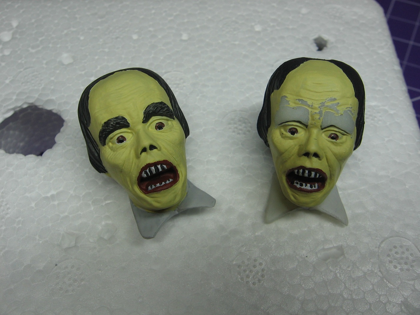
Returning back to working on the face…I’m happy with the jaundice color choice I’ve made.
(DISCLAIMER: The following photos were not taken with my light box, or with proper camera settings. The jaundice intent appears greener in the photos than actuality. I will make an effort to present proper images in the future.)
Having said that…the eyebrows…ugh. These have been bothering me for some time now. The eyebrows of the character portrayed by Lon Chaney in the 1925 silent film, which is the character this build is based on, where not huge forests of hair as is portrayed in the mold. Contrary, as is indicative to the image of the character upthread, the eyebrows where very minimal, if there at all. Further, in my mind, the bushy eyebrows possibly takes away from the emphasis (not sure how to word this) of the dark circles around the eyes (which I haven’t applied yet).
Anyhoo, this image shows the eyebrows painted with Vallejo Model Air 71.056 Panzer Grey.

Eyebrows on the test mule head sanded off.
Coat of primer applied.
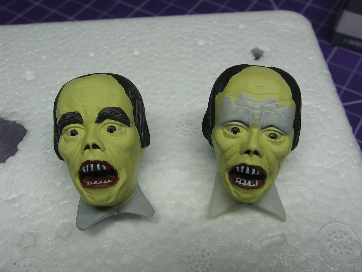
Two coats of jaundice base coat applied.
I’m totally aware that touch ups to eyes, and teeth are still necessary. Work in progress. Once I’m happy, I’ll be applying a gloss coat in advance of applying a wash to the jaundice portions.
Thanks for looking.
Cheers,
Mark
5 Likes
Super scary!!!
1 Like
Looking good Mark! I think that a wash will really make those little lines and creases POP!
1 Like
Great progress Mark. I agree with you on your color selection… and once you finish your touch ups he is going to look fantastic ![]()
![]()
![]()
![]()
1 Like
I really empathize with your frustration with the colors and the eyebrows etc. This is a very difficult subject! Faces are among the hardest, let alone a sickly scary one! I think taking the eyebrows down a notch was the right call.
With this project, I’d argue that you’re fully across the line from “accurate scale modeling” into “artistic representation” and art, as they say, does not come easy.
You’re making good progress, though – keep after it!
2 Likes
The face without bushy eyebrows is looking better.
2 Likes
No it does not. I have NEVER considered myself artistic. At least not in terms of drawing, as an example. But I suppose art is more than just the ability to put something on a canvas, so to speak. I’m beginning to believe that ideas and adaptations can be an aspect of art as well. Not sure I know what I’m trying to say, but it kind of makes sense to me.
ETA: Thanks everyone for the input. I’m going with the smoothed eyebrows. Sanded them off the useable head today and laid down a coat of primer on it.
Cheers,
Mark
5 Likes
Remember modeling is a hobby and it’s supposed to supply us with relaxation. You model for yourself first and go with what you feel is best for your project.
3 Likes
You took the words out of my mouth ![]()
![]()
1 Like
Progress:
Yesterday, I got the first coat of jaundice color on the area of the sanded eyebrows of the “good” head and touched up some spots on the inside bottom right of the cape and applied another coat of red. Later, I removed the masking and a few bleeds and uneven edges were revealed. So, I began masking the red again.
Today, I applied a second coat of jaundice color to the sanded eyebrows of the “good” head, and touched up the irises (Flat Brown) of both heads. Then, continued masking the cape red in preparation for touching up with Panzer grey.
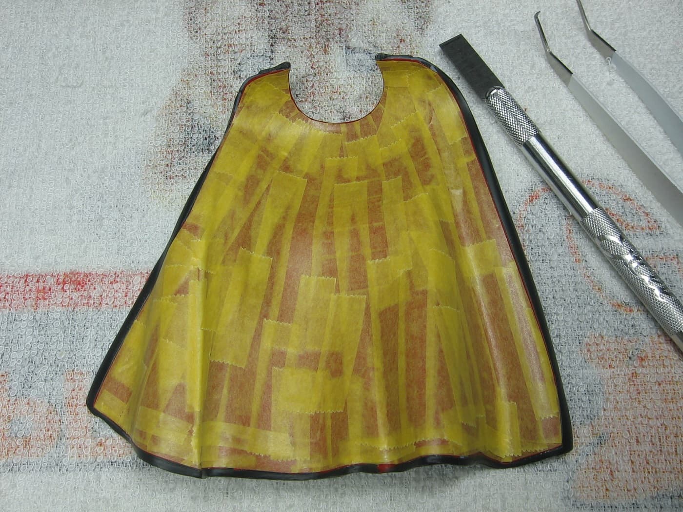
This masking took 3 hours in total.
Thanks for looking.
ETA: I also painted the whites of the eyes again. Jaundice affects eye whites as well as skin, and I wanted to capture that. Originally, I had painted the whites same color as the skin, but I wasn’t happy with the lack of contrast. So, I reversed the paint mix for the eye whites. Instead of 75% Ivory and 25% White (the skin mix), I went with 25% Ivory and 75% White. But it was still too dark, so I tried 12.5% Ivory (1 drop) and 87.5% White (7 drops). I’m happy with that. Just enough to give them somewhat of a jaundice appearance, but introducing contrast as well.
Oh, and the teeth…I painted the teeth the same color as the eye whites.
Cheers,
Mark
4 Likes
Update time. Where to begin?
Three aspects to cover with this update. I’ll start with the most challenging and go from there.
The Head/Face:
I learned a new term a couple of days ago. “Scope Creep”. Thanks to @Toimi_Tom and @PhoenixG for their interaction on that in Johann’s 1/20 Hasegawa Ma.K. Falke Mk01 thread. Post numbers 91 and 92. I agree, it is a real thing and should be added to the FSM glossary, IMO.
I was struggling with the teeth on the head I’ll be using. Specifically, the teeth gaps of the upper row. I was just chasing touch up after touch up after touch up. I would apply the “white” (a mix of white and ivory) and then fill in the gaps with black. Inevitably, I would apply too much black and it would cover some of the white on the insides of each tooth. So, then I would go in to touch up that with more white. But then that white would cover up too much of the black. Back and forth, back and forth. I tried different fine application methods, even reverting to using the point of a sewing needle. Eventually, I stripped (picked) the applied paint off, as it was getting too thick, and started over. I finally got it. But did I? As my wife says, we are our own worst critic. While working on this, I’m wearing magnifying vision aid glasses, which obviously emphasizes detail. To the point that I see the flaws clearly. Which brings it to that age-old question…at what point is it good enough?
Another term that I have learned recently, in my brief scale modeling life, is “standoff scale models”. Credit for this term goes to “Fox”. Fox is on another forum I partake in, but I believe he’s here as well. @fox are you here? At any rate, fox’s “Standoff” term refers to observing a model generally from 5 to 10 feet away and the model looks great! Exactly! I know the flaws are there, but anyone else looking at my work (read: on display in my house, not at a show) will not be looking at it much closer then 3 feet minimum. They won’t see the minute imperfections!
Long story, short…. scope creep is definitely something I experienced with the teeth gaps. I STILL see a flaw or two there to be improved upon, but enough is enough. And for the sake of screwing up the next improvement and continuing to just chase it, I’m satisfied that I’ve done the best that I can.

The test mule is the head on the right. The white dots on the pupils are catchlights. Not sure if they add or detract to the look. (No pun intended). I’m leaning toward going with them. Opinions?
Next, I intend to add in “raccoon eyes”. I’ve looked online for some sort of tutorial on how to go about adding these in, but to no avail. Going to try a modified dry brush method. Some experimenting is in order first. Never dry brushed before.
The Cape:
Some scope creep here too. Just not as bad.
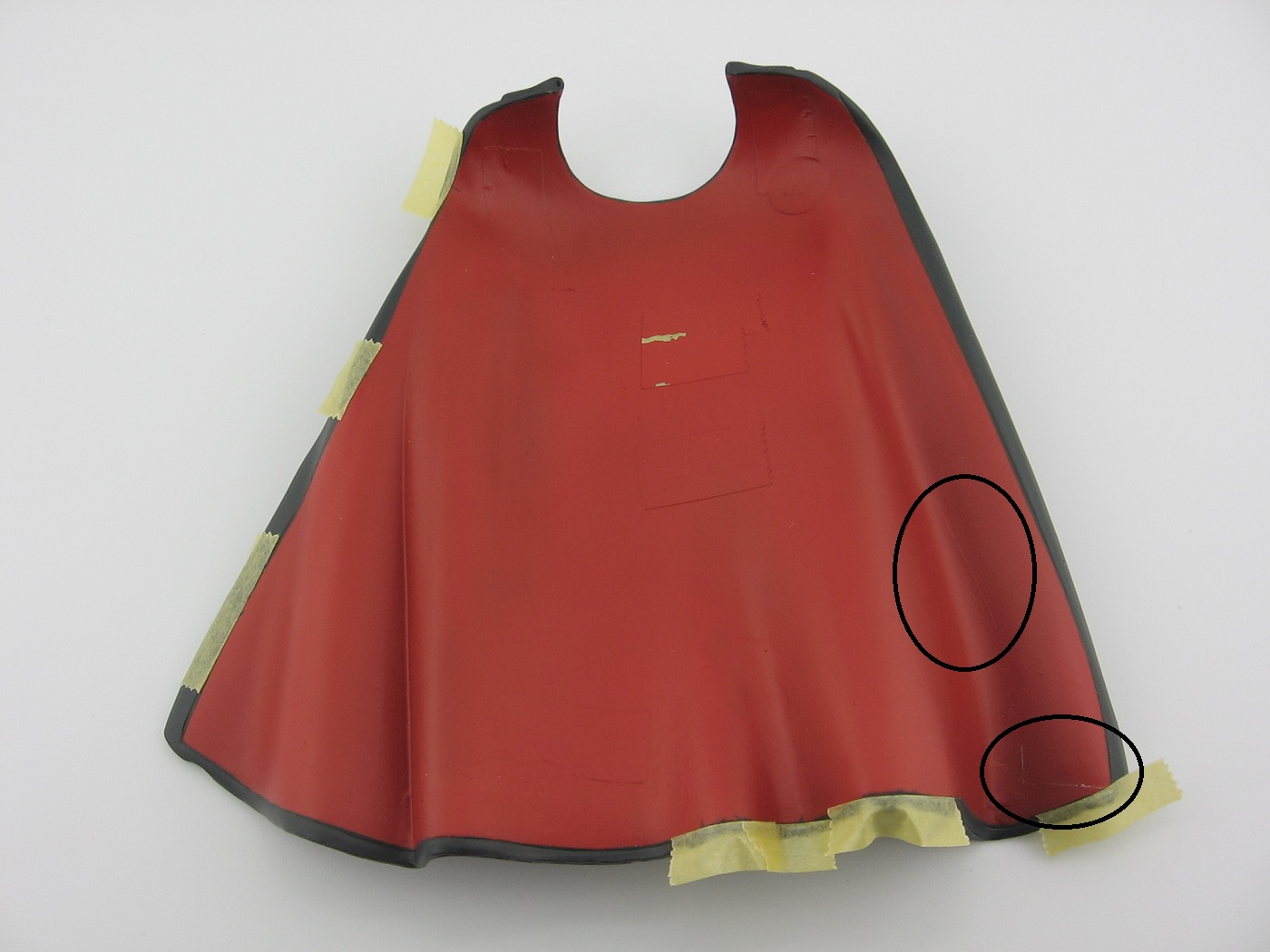
The areas circled in black indicate previous masking marks (when masked for painting the Panzer grey) that somehow got worse over time.
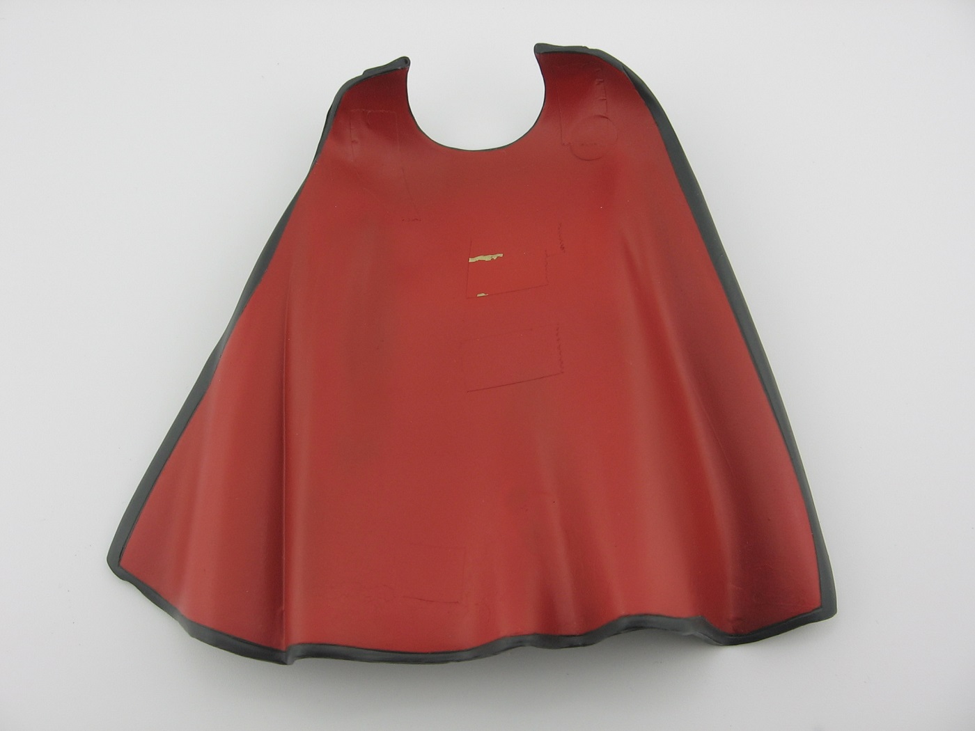
I’m considering this complete. The inside tapes are cementing points and will be removed when the time comes.
Lesson Learned: In hindsight, I suppose I didn’t have to mask for the red.
Lesson Learned: In hindsight, I should have painted the red first, and then masked for and painted the black.
The Shirt:
I want the shirt to have a somewhat dingy look to it. The paint will be a white / white-grey mix. In addition to that, I got it in my head, while touching up the suit, that a little pre-shading might work here. So I gave the shirt a couple of bursts of the Panzer grey.
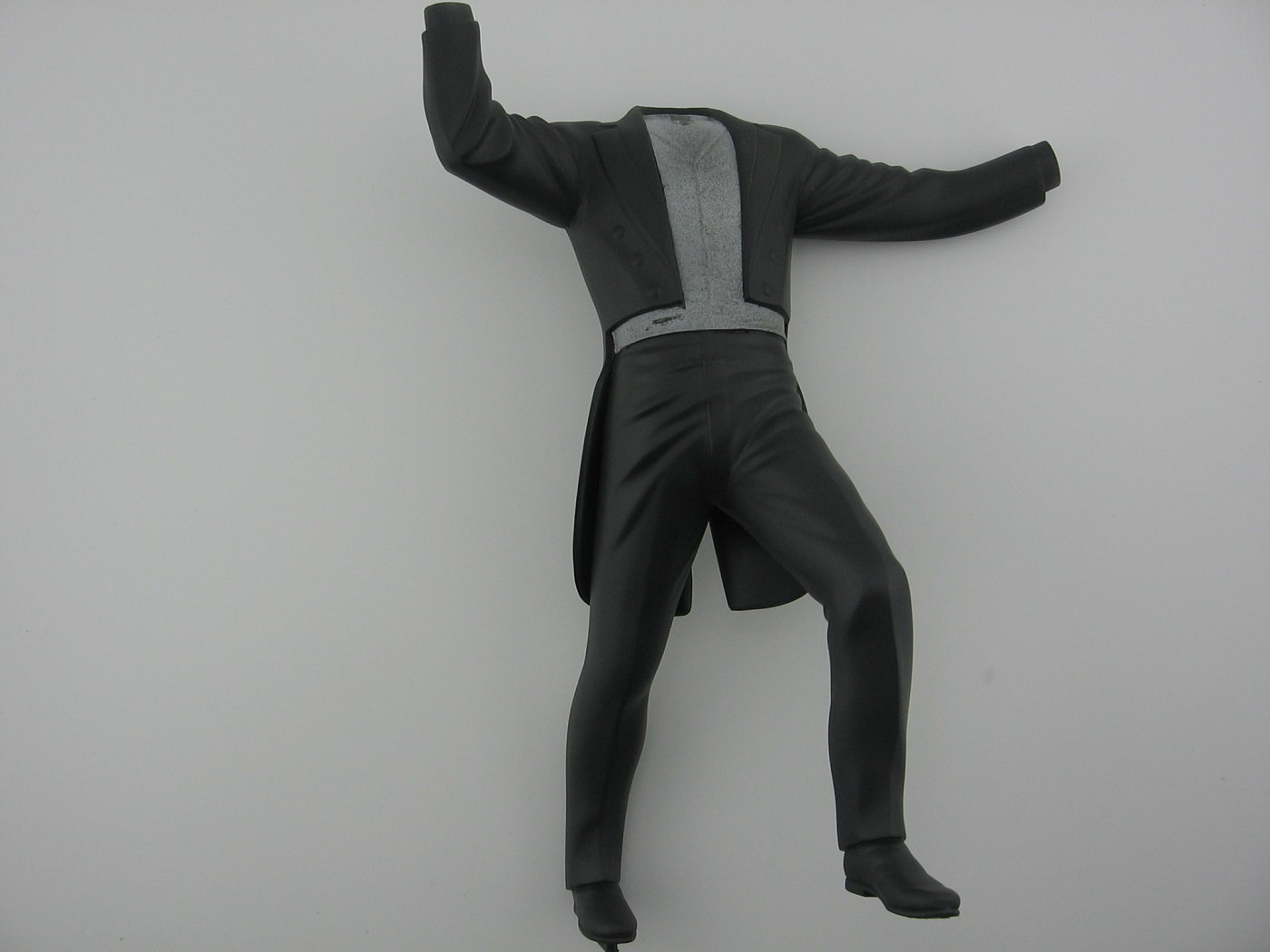
And masked and ready for the shirt base coat.
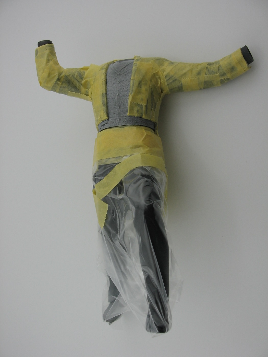
Lesson Learned: As with the cape, I did this out of order. I should have done the shirt (and cuffs) first, and then mask that off for applying the Panzer grey to the suit. That way, masking the suit for painting the shirt would not have been necessary. Me thinks that white overspray onto the suit would not have been a problem. Opinions?
Thanks for looking. Suggestions are welcome.
Cheers,
Mark
3 Likes
Hey @MisterMeester,
The heads are looking great. Personally I really like the catch lights on the test head. They give the face more life.
The panzer grey for the suit looks awesome! I also think the preshade on the cape turned out well. Enough remained to indicate shadow which is really all that is needed.
I’ve done the same thing with painting out of order and making more work for myself. Might want to try hitting the cuffs with some form of lighter grey first to make it easier for the white to show. The base being so dark it will be hard to get enough white on them so the panzer grey doesn’t show through.
Regarding the order of operations for the shirt. If you had done it first and had some white over spray it wouldn’t have been a big deal. It’s a lot easier to go over a lighter color with a darker color than the reverse.
Excellent idea to cover the pants with a baggie!
Your Phantom is coming along great! ![]()
![]()
1 Like
A baggie is a good idea. I use cheap aluminum foil for masking. You can conform it to your subject and tape down the edges. Works well.
And you’re right. We are our own worst critic (though in my case, no one else has to look at them, so maybe that’s not true).
Gary
1 Like
Wonderful job on the head Mark… He is definitely coming together ![]()
![]()
![]()
![]()
1 Like
Thanks for the advice re: the cuffs. It is a concern, but I wasn’t considering it enough of a concern. I’ll put some lighter grey on them first.
Cheers,
Mark
Your Phantom is looking so good Mark. I think that you finally got the head the way you want it and the clothes look so good. Your paint laid down so smooth on the cape and clothes.
1 Like
Short update. Putting the catchlights on the mule head was so easy. First try and bam! Can’t say the same for the head I’ll be using. Scope creeping the catchlights on that one. Fifth attempt and counting. I keep getting a dot that is either too large, or one not in the correct position. Will try again in the morning. Argh.
Airbrushed an off white mix on the shirt and cuffs. I think that turned out ok.
Cheers,
Mark.