My Phantom is a rebuild of an original Aurora kit, which I did years and years ago. He’s pretty much as he would be from the box. I made sure not to make him look too garish (I see too many with green skin!) and strived to make the prisoner look properly terrified. I didn’t bloody him up much and made sure the exposed bones (though not really authentic) weren’t stark white, I replaced all of the bars on the dungeon and even added some French words (“egality”) to look like he scratched them on the walls. I also used liberal amounts of talcum powder on the base to soften the look of the rocks. All in all it was a fun re-do of a kit I probably built in 1967!
4 Likes
Hi Jeff. Welcome to the forum! Thanks for your post. Feel free to post a pic of your build if you like.
Re: the green skin….Skin colour is one aspect I’m mulling over right now. I see Erik as quite the sickly guy. Part of that vision is that he had jaundice. I have one coat of Vallejo Model Air 71.106 Ivory on his face, but I’m not sure. I’ve seen jaundice before (golf buddy had it couple years ago during early stages of pancreatic cancer), but I’m thinking the ivory colour might be too yellow. Just bought a bottle of Yellow Ochre yesterday. Going to play around with that and maybe some lightening as well. Hoping to get an update post up soon.
Cheers,
Mark
I am humbly honoured to have a link to this thread included in the current FSM digital weekly newsletter emailed out today. Thank you FSM! Makes me now want to do as best I can on this project. No pressure! ![]()
Cheers,
Mark
4 Likes
Welcome to the forums Jeff!
In the words of the late, great Leslie Nielsen:
“Good luck. We’re all counting on you.”
1 Like
You wouldn’t happen to have a picture of head? I’m curious to see what it looks like.
Yellow ochre is such a versatile color. I use it the way some people use burnt umber or sienna.
Congrats! The only pressure is what you put on yourself. Don’t change a thing. Treat it like the compliment it is intended to be. ![]()
1 Like
@PhoenixG [quote=“PhoenixG, post:66, topic:373194”]
You wouldn’t happen to have a picture of head?
[/quote]
Not yet. Shifting focus from Titanic to this build for awhile. I’ll have a picture of the head tomorrow.
One advantage to these glow in the dark kits is, there’s two heads! I put primer on the second one yesterday. Going to put the yellow ochre on it tomorrow as well. Planning on doing some lightening experiments as well. I want to see what the ivory looks like lightened up a bit.
Ready to start painting the other parts as well, except for the main body. Have to mask that still. Not enough time in the day for all of it, but I’ll get some of it done.
Cheers,
Mark
1 Like
I’m liking the work that you’ve done so far. I have this kit in my stash and will be following your build closely. I’d like to start my kit next Fall for Halloween.
1 Like
Thanks Tom. Looking forward very much to your build of this awesome model!
Cheers,
Mark
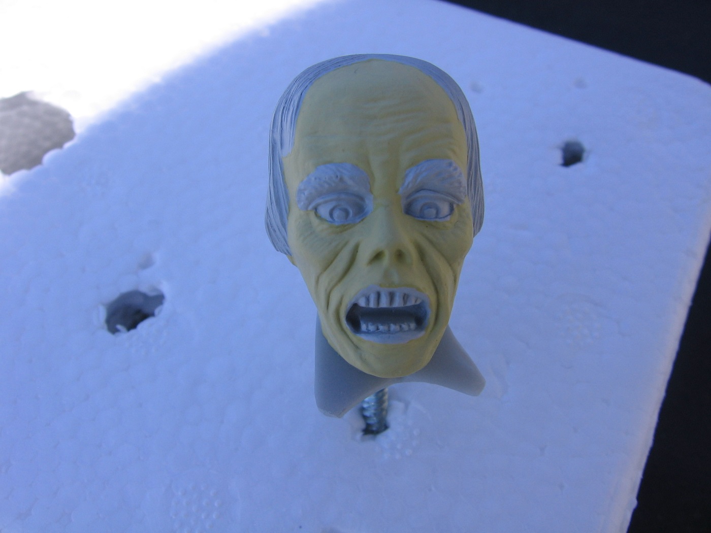
Trying to choose a base color for the face to replicate jaundice.
This picture shows the first head on the left with one coat of Vallejo Model Air Ivory, thinned with Vallejo Thinner Medium 3:1. The head on the right is the “glow” head, with one coat of Vallejo Model Air Yellow Ochre, same thinner and ratio.
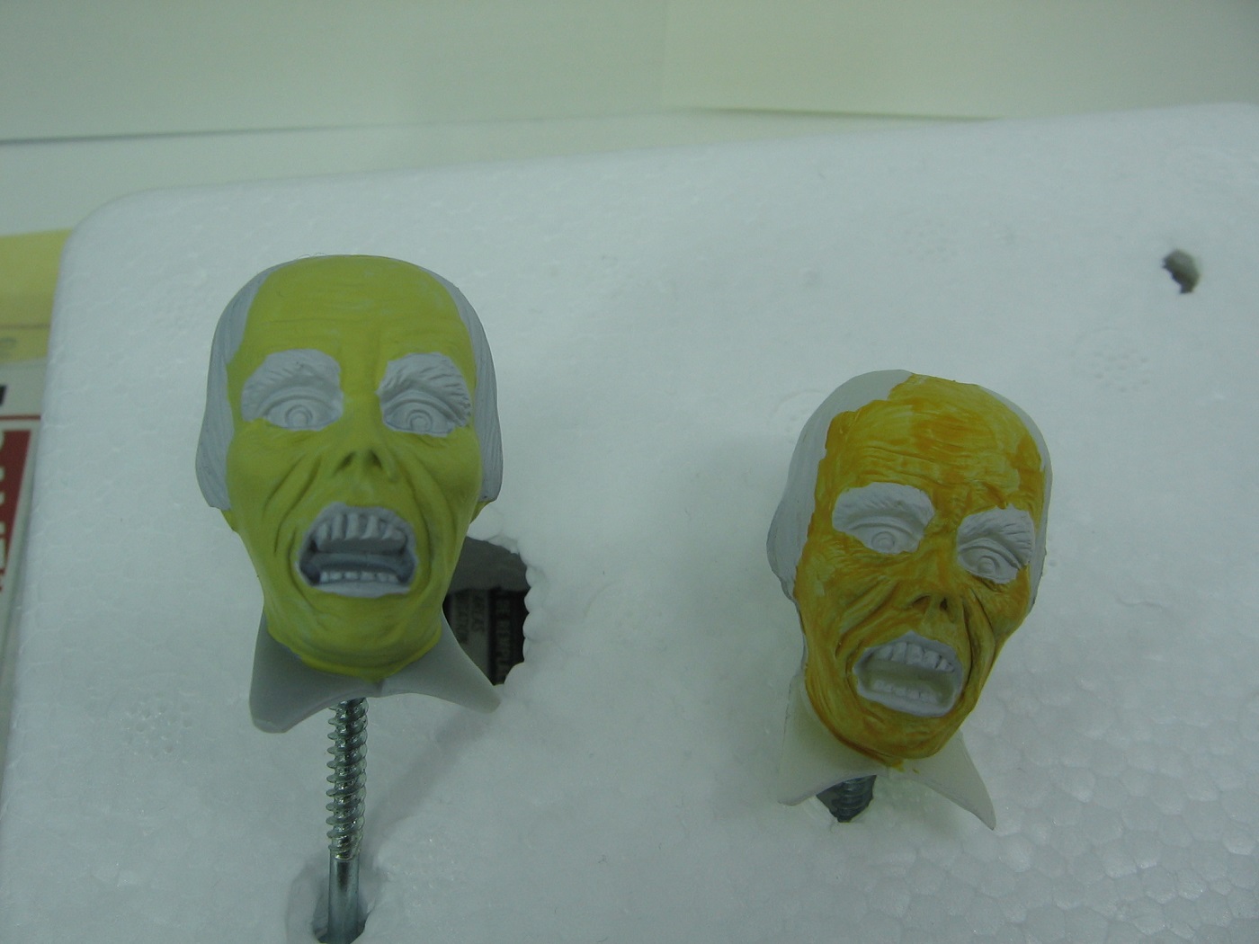
I’m inclined to prefer the Ivory on the left, but it’s just not right. Too green, I think. The Yellow Ochre is too orange, IMO.
Also of note, the Ivory had better coverage.
Here’s an image of actual jaundice from the internet. Hopefully this is allowed. Admins please let me know if not and I’ll delete it.

It’s difficult finding a consistent image of jaundice. Some are on the yellow side (my preference) while some are on the orangish side.
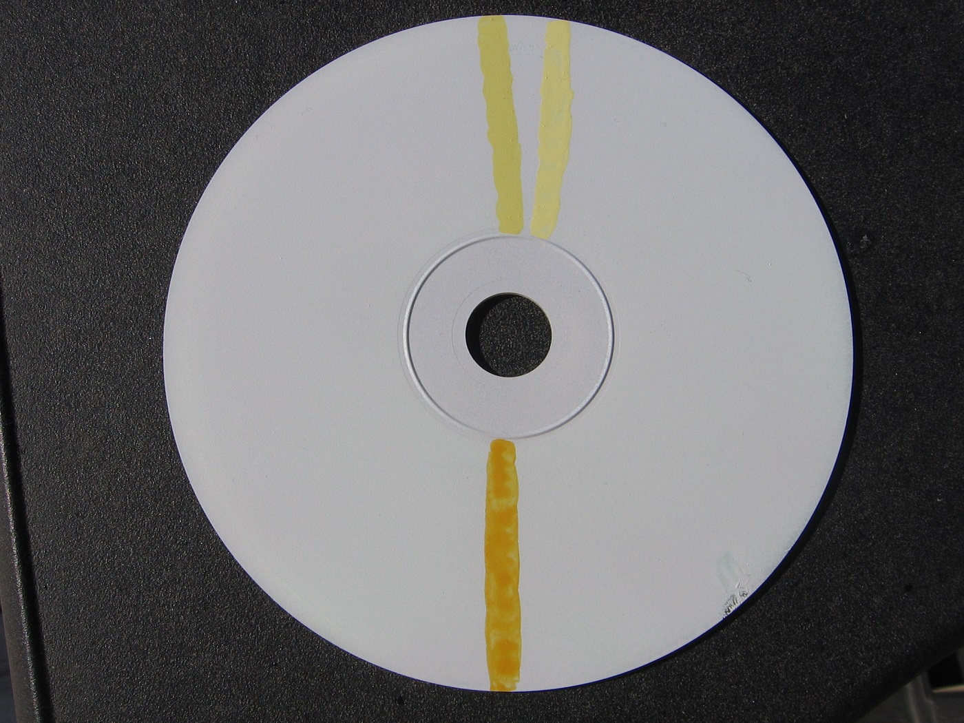
I lightened the Ivory with Vallejo Model Color 70.951 White. 75% Ivory; 25% White. Same thinning ratio as above… 3:1.
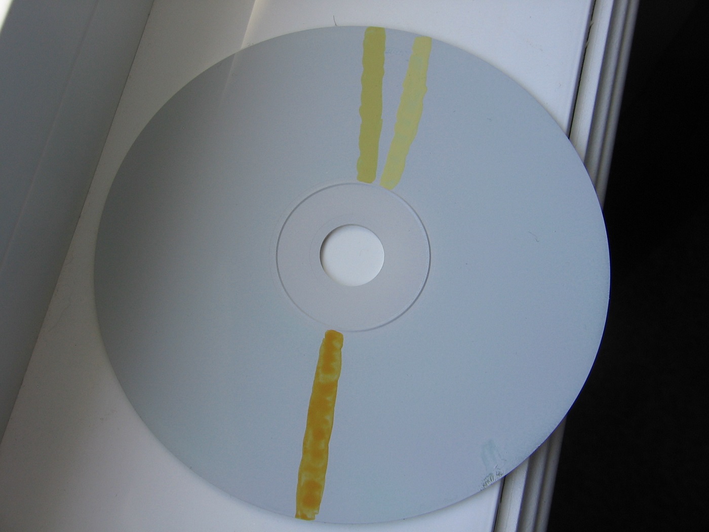
Here’s the result on an old dvd…
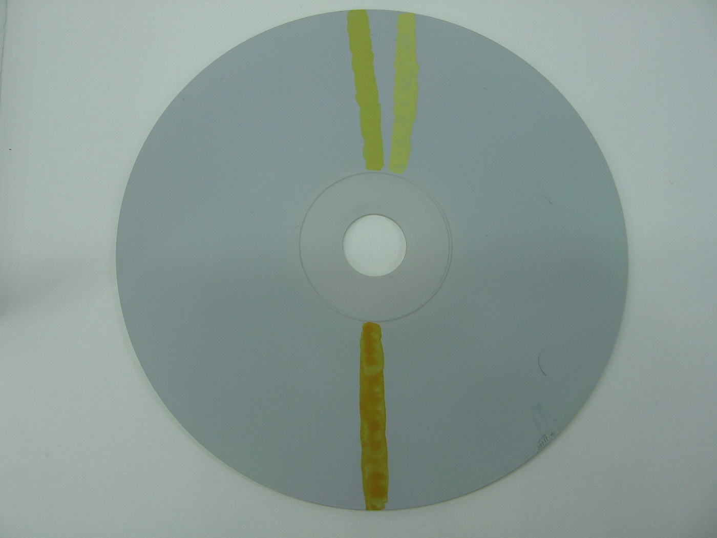
Yellow Ochre, not lightened, on the bottom.
Ivory, not lightened, top left.
Ivory, lightened, top right.
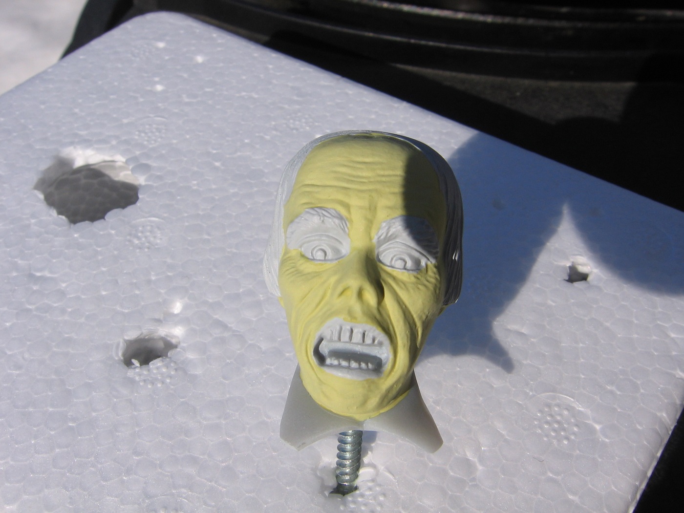
This image shows the head on the left with the lightened Ivory applied as a second coat on top of the non-lightened coat.
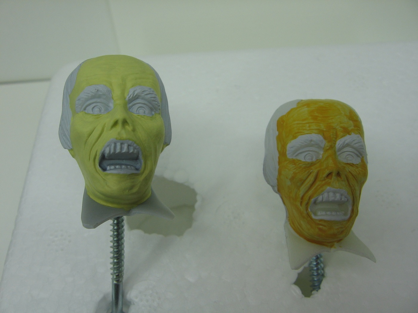
And the Ivory head on it’s own with the second coat. It’s definetly more yellow and less green than it was. Might be hard to tell here. I used my spray booth as a light box for all pics, but I’m not so sure that is a good option.
Planning on playing with lightening the Yellow Ochre tomorrow, but I’m leaning towards the lightened Ivory.
Thanks for looking. Thoughts and suggestions are most welcome.
Cheers,
Mark
3 Likes
Without hashing it out all over, I’d refer you to the discussion in my armor thread here about how choosing colors is so difficult.
You have it in your head what it “should” look like, but how any given shade might be captured by a digital camera and then represented on some other screen – there are so many variables that it’s almost a lost cause. Work towards what looks right to your eyes in your lighting conditions and run with it!
For me, with what I have in my mind for “jaundice” in combination with the photo you shared – it’s definitely a yellow color, with indeed a shade of greenish/greyish. In some areas with higher blood flow, like the cheeks, you can get some orange, trending toward a rusty brown in the under eye area.
I’ll point out this is a color discussion I never thought I’d have, let alone on a scale modeling forum… but hey, it’s a good exercise!
A quick edit to note that I just noticed my laptop was automatically in “night light” mode since it’s after sunset – which warms all colors up and filters out blue, to ease eye strain later in the day! Looking again at your photos the greens are even stronger across the board. For what little that’s worth…
4 Likes
Have you considered painting the head/face in a pale skin tone and then use a wash,glaze, or acrylic inks for that jaundice shade?
2 Likes
Thank you. I will definitely look at your Armor thread. And yes, the pictures definitely look different to what I actually have on my bench.
Cheers,
Mark
1 Like
My original thought (months ago) was to just go with a pale flesh tone period. But then got the jaundice idea. It’s only been recently that I’ve considered augmenting the jaundice paint with a wash. Never considered a pale flesh with a jaundice wash. Since I don’t like the yellow ochre, I might just strip that paint off the second head and experiment with your idea. Thanks!
Cheers,
Mark
1 Like
When girl kid was born, she wound up with ABO hemolytic disease and was pretty severely jaundiced. What I see in the picture above isn’t at all what she looked like!
The short description - the TL;DR if you will - is that she looked like an aging bruise.
The yellow for her came from the breakdown of the blood cells to produce bilirubin, which gave that “old bruise” color. It was quite noticeable, but less … garish? … than what I’m seeing above. More of a yellow-orange-brown. If that helps!
2 Likes
Thanks for your reply. Sorry to hear your daughter went through that.
Looking at the pictures again, the ivory face looks way greener than what it actually is. I read through the discussion on colour in Tom’s armor thread and that’s basically it. My camera, or more accurately…the lighting, is not capturing what the colour actually is. Going to have to sleep on this. At my skill level, I might just be biting off more than I can chew. Might just abandon the idea and go with a pale flesh tone and try some shadows and highlights.
Cheers,
Mark
What @Toimi_Tom mentioned is golden and I may have to go check out his thread in choosing difficult colors.
@gomeral has it going on too.
Whichever way you go with it, I’m looking forward to seeing what you’ll be doing here Mark.
1 Like
Thanks for the reply, Joe. Talked to the wife last night at bedtime, and have now slept on it. The pictures are just bad. Some of the worst I’ve taken in the hobby so far. I recently read Tim’s article on photography in the current magazine issue and thought I’d try my spray booth as a light box. Turns out it’s a spray booth only and not a light box. My wife makes and sells earrings. This afternoon I’m going to try the light source she uses when she takes her earrings pictures.
Cheers,
Mark
1 Like
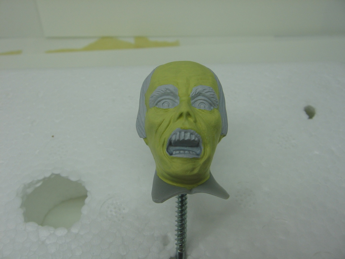
Playing with different light sources for the last hour or so. The wife’s light box. The wife’s preferred photography lamp. My desk lamp. And good old fashioned sunlight. The following pics are all sunlit, either direct or indirect. Some out on the deck, and a couple of others on a window sill.
These a more representative of the color I see on my workbench.
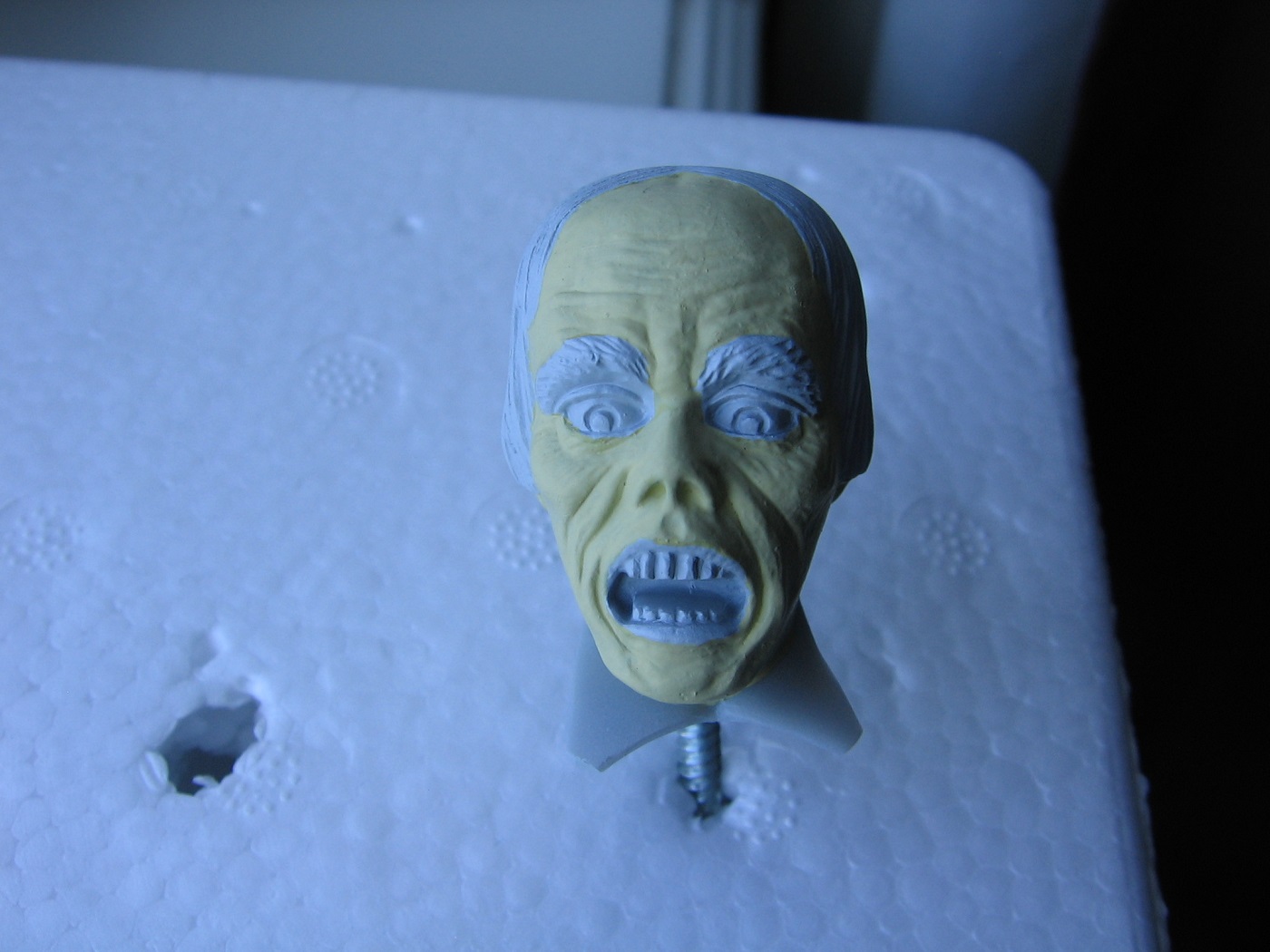
Still open to feedback if one so chooses to offer some up, but I suppose it’s like Tom says. It’s ultimately up to me and what suits my eye.
In the meantime, I think I need to research still photography a bit, and what color temp is best for that. Going out on the deck to take pics in sunlight all the time just isn’t going to work. Especially at -35C during the darkest days of Winter.
Thanks for looking.
Cheers,
Mark
4 Likes
The pictures in different lighting was very helpful. It looks like the spray booth has a very blue light in it. Sometimes all that’s needed is manually adjusting the white balance of the camera.
Really good suggestions provided for working on the color of the head.
By attempting to do more than we are currently capable of is how we grow our skills. Otherwise they never change. One of my favorite phrases is “we learn more from our failures than our successes”.
![]()
So have fun testing out different methods to see if you can find something you like!
I’d add one more suggestion to those already shared.
Use the dual action airbrush to lay down mist coats of thinned Yellow Ochre on the Ivory Head. And the reverse. Add mist coats of Ivory to the Yellow Ochre Head. You can lay down very thin translucent layers this way allowing the colors underneath to influence what you’re putting on top. You can slowly build up the layers and see if either methods gets you any closer to what you’re looking for If it doesn’t work out, a quick bath in isopropyl and they’ll be ready for primer and a new test. ![]()
3 Likes