Wow. You’ve done an excellent job so far!
Thanks guys! Happy to share. =]
Thanks RadMax8. Darker colors can be tricky. The color scheme will determine the difficulty especially when you add in camoflauge to the mix. When doing this type of painting or really anytime painting in darker colors, it’s best to apply your darker colors in thin coats. You’ll have more control over how dark is too dark…and where…depending on how complicated you’re trying to get with it. One trick to keep in mind is that the darker the color the more that wear and tear will look lighter on its surface. Especially blacks. I can recall that old Jim Belushi 80s movie “K9” I think it was where he’s telling some bad guy about his car saying how “black–oooo, that’s a hard color to keep clean.” There’s a P-61 that lawdog did here on the forum that comes to mind you could reference. He actually did a pretty good job doing black. Makes me jealous to go start the F-117 or B2 I plan to do one day. Go check it out when you get a moment. But the big take away is to either leave room to go darker, or plan to follow up with post shading in a lighter color and possibly blend the coats or blend with oil weathering if desired or necessary. In my next post, I’ll be sharing a little more about what I did here with this hellcat. My airbrush started to betray me just after starting the Sea Blue color and I was hardheaded about trying to fight through it to keep it where I wanted. Also screwed me at the very end. Should’ve just stopped when I was ahead, but that’s how it works huh.
Just learned that Flickr is about to slit its own throat by locking accounts with over 1000 photos. I’m using .3 percent of 1TB that they allow for their free acounts, but I guess it’s more important to use a stat like “n” number of photos. So starting Jan 8 they thought they get rid of all their users. Love to see how that’s going to work out.
Anyhow! I might have a slight delay in how I upload pictures to post. We’ll see.
Back to painting…
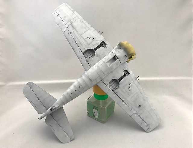
I personally like to start with the bottom surfaces and work my way up. This way I can wrap my colors up the with clean and simple overlaps. Generally, undersurfaces are lighter in nature like whites or greys and make blending very easy. Touch ups are also simple to come back to without losing detail. Or replacing it. =]
 Untitled by Britt Vallot, on Flickr
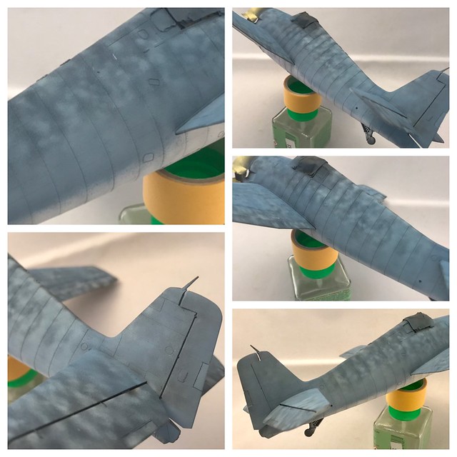
Pretty much tells its own story. One thing to note is where the lap joints meet along the fuselage, they are darker and lighten up as they meet the joint rear of it. So I put more paint down on top of these joints like you see.
 Untitled by Britt Vallot, on Flickr
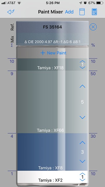
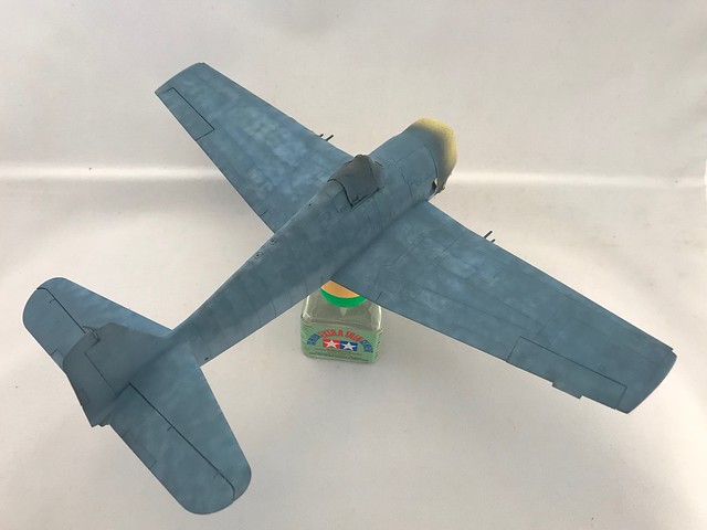
Here is beginning to lay down the Intermediate Blue. I have an app on my iPhone that does an excellent job of mixing paint for me in proper ratios. I have a bunch saved already from a ways back, but on this color I had to make a few changes to get there since I was missing one of the colors I picked to complete the proper mixing.
 Untitled by Britt Vallot, on Flickr
 Untitled by Britt Vallot, on Flickr
 Untitled by Britt Vallot, on Flickr
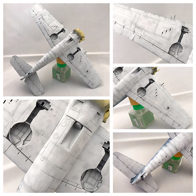
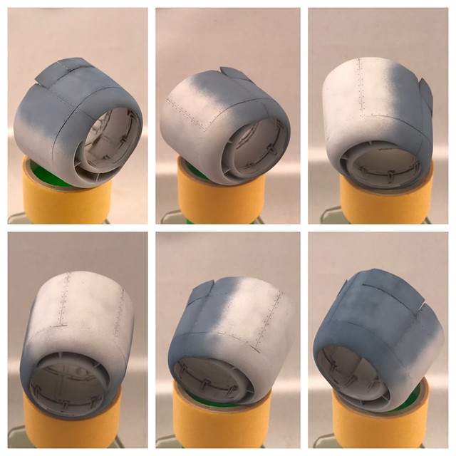
Quick look at the cowl.
 Untitled by Britt Vallot, on Flickr
Happy with the results. =]
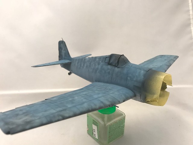
I next put another thin coat in between here to transition to the Sea Blue color that will come next. This was made with Flat Blue and Light Grey and a little bit of Flat White. Really, this was just to my eye. In the past, I used to be a bit more precise about it.
 Untitled by Britt Vallot, on Flickr
 Untitled by Britt Vallot, on Flickr
 Untitled by Britt Vallot, on Flickr
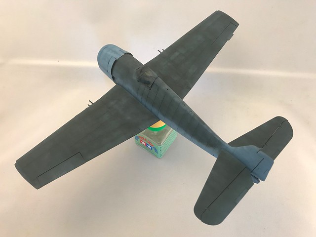
Here’s where the frustration began. I do apologize that I don’t have a better example of what “to do” here. Having taken a long step back to look and reflect on where I’m at, it really is an honest depiction of color and weathering from hellcats of the day. My frustration is that I didn’t get there with the control I wanted to have and maintain. The color is appropriate, but it felt a little darker than what I wanted. The more I look at it, the more I realize it’s actually right where it needs to be. I shouldn’t have to second guess the colors I chose. I think I was just upset at how I was losing detail to the fuzziness of my spray and the loss of detail underneath in places I intended to emphasize. Meh! Moving forward.
 Untitled by Britt Vallot, on Flickr
 Untitled by Britt Vallot, on Flickr
 Untitled by Britt Vallot, on Flickr
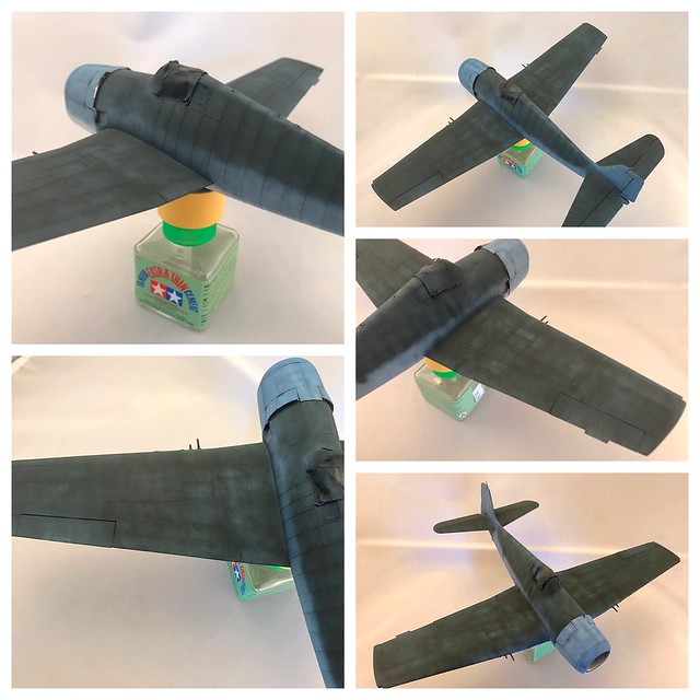
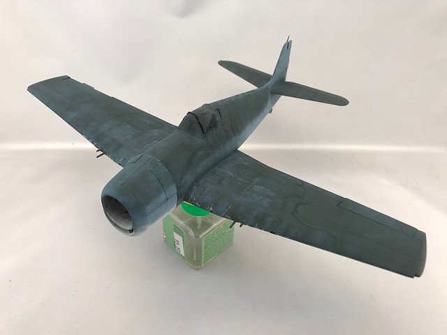
So even though this isn’t exactly what I intended to show, it is in the right direction. To build up this surface I began to marble in the darker color slowly so as not to blot out all the lighter color underneath. If you’re only doing a blend coat with colors this dark, you will lose some of the nuances going on underneath. Some of this would have shown better if my nozzle would have stayed true to me. I intend to go back over certain of these parts with extra weathering, but I like to set up my surface and get as far as I can with the painting first as it’s more reliable to me. Just my preference. In photos of WW2 hellcats that weren’t too beat up, this is actually on the money here. What I originally aimed to do would’ve just come in a coat or two more to get to here.
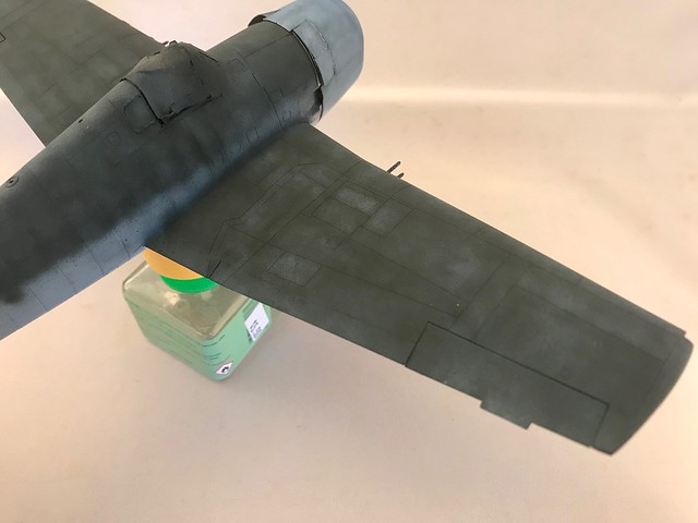
Next, I’ll get to work on some chipping and tidy up some of my overspray gafs and throw down a thin coat of some Medium Blue XF-50. Tamiya’s Medium Blue is actually dead on for a 10% fade of Sea Blue. I’ll mix in a little of Tamiya’s Sea Blue when painting with it. As I mentioned before dark colors like Sea Blue will show a lot of “dirt” the same way your car or truck will. A slightly lighter, faded color is just the thing. This will go a long way at making a more convincing paint for a dark color like this one. Here’s a quick example of what I was playing with to practice.
 Untitled by Britt Vallot, on Flickr
Plenty more to come. Still exciting things left to paint. =]
Let me enumerate: Research, patience, thinking ahead, determination, ability to visualize color and camo schemes, photographic as well as modeling skills … etc., etc.
You have all the above in spades.
This will be one of the main reference works in progress threads I’ll end up using for reference when I get around to my Eduard 1/48 F6F-5.
Thanks for this detailed WIP!!
Looks better with every update. The paint work you’re a bit frustrated with, I’d kill (ok, maybe maim) to have show up on my birds. This is truly a supreme build.
Superb painting and good job discribing the layering process. I’m definitely going to reference this thread when I get around to building a couple tri-color birds in my stash.
Damn Mike. I’ve learned to just say thanks…but I certainly don’t feel worthy of praising on that magnitude. There’s so much I’m lazy about that I could clean up here on the forum for posting. But thank you. Very happy to hear it’ll be of some use. There’s plenty I’m glossing over. I realize some of it sort of speaks for itself if you stare at it long enough, but even still if there’s something I didn’t touch on…just ask. =]
Thanks Matt and Max. Yeah, the painting part is the really fun part for me. I am pretty hardheaded though, so naturally I went back and put down some detail I felt needed to show and tried to get in front of some weathered painting that I’m confident is going to reduce some of what I want to show. So from here it just means adding an extra step in post shading to add what was lost. I got around to fixing it late last night. Much happier with it, but it still needs just one more slightly darker coat after the fade I put on it. That Tamiya XF-50 is really really a good pick straight out the bottle for a faded Sea Blue. =]
Currently, I’m trying to sort out some photo posting issues with a new sharing site. So I apologize to everyone on the forum for these next few attempts to settle this score.
deleted.
Watching…and learning.
Good morning guys. Back with a short update with painting.
I’m not such a control freak (honest) but I am aware of what I generally expect to happen next after a clear coat and weathering and I felt the need to put back some of the lighter blues that I wanted to have present before dropping some faded Sea Blue on top of what I last ended with on the previous post. So I went back in an effort to be proactive about what I was afraid to lose in sublty in lighter tones.
 Untitled by Britt Vallot, on Flickr
 Untitled by Britt Vallot, on Flickr
 Untitled by Britt Vallot, on Flickr
Basically, I’m just post shading to fill in what will be painted over again. Kinda like growing more hair to cut…better.
I also went ahead and took care of the cowling while at this point. Here’s a few pics of that.
 Untitled by Britt Vallot, on Flickr
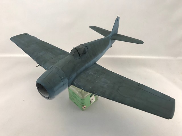
Once that’s done, I went back over it to apply the faded Sea Blue coat with a mix of Tamiya’s XF-50 Medium Blue and XF-17 Sea Blue (just a touch of Sea Blue as it’s fairly dark) This was done in the same marbling pattern of painting. I only used blending patterns of spray sparingly and lightly. And really only in just a few spots as I’m trying to make use of the light and dark tones and riveting to show how the plane wears over time across how the rivets tie down the aluminum surface. In some instances of extreme wear, you’ll notice the stressed skin seem to billow up from where it’s buttoned down across the plane. Nothing that crazy on this build. It wouldn’t be appropriate at this scale to notch and cut into the plastic for something so subtle. Painting and weathering will suffice to bring the eye’s attention to happenings like this. =] I do plan on doing a high shine all aluminum warbird one day that makes use of some bending and bowing across the surface. That ought to be fun to see.
 Untitled by Britt Vallot, on Flickr
 Untitled by Britt Vallot, on Flickr
 Untitled by Britt Vallot, on Flickr
 Untitled by Britt Vallot, on Flickr
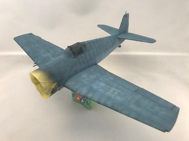
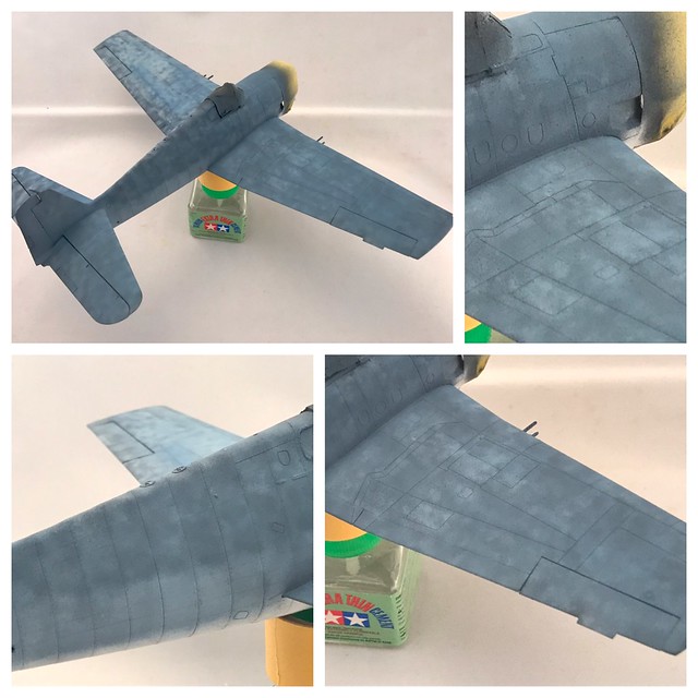
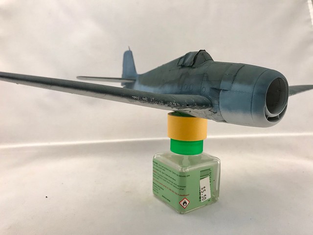
After the faded Sea Blue coat went down, I came back in with some Sea Blue straight out the bottle to put back a little contrast where I needed it. I also placed the cowl on to make these two parts tie together more seamlessly.
 Untitled by Britt Vallot, on Flickr
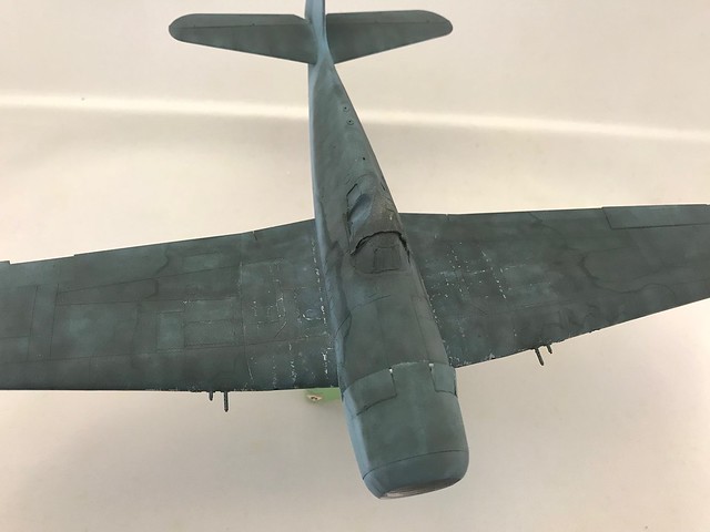
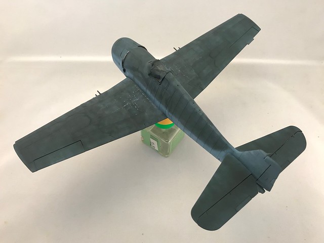
Here you can see some of the lighter tones in between the riveting and lap joints.
 Untitled by Britt Vallot, on Flickr
Much happier with this ending. I may have been able to keep what I had after the next step, but I hate not doing something. I’d rather strike out swinging. =]
 Untitled by Britt Vallot, on Flickr
 Untitled by Britt Vallot, on Flickr
 Untitled by Britt Vallot, on Flickr
And this is where it stops for now. After reviewing these photos I realized that I spent so much focus on getting the wings exactly as I want them, I completely forgot to fade the elevators and horizontal stabs. I’ll get them next time. I’m currently waiting on a set of Montex masks to paint on the insignia. I tried my hand at cutting my own, but with my frustrations over my poor airbrush badluck I just didn’t have my head and heart into it.
Any questions about anything here…hit me.
Excellent paint work. I’m learning a ton with this thread. Thanks!
Cheers,
Mark
Indeed. Although I’m not a fan of the technique, you have nailed it my friend.
Awesome post as always[Y] Love the paint work! And thank you for giving your Tamiya mixtures it really helps.
Yikes , Yowie and Chit !
Dis is gotta be the best build of that plane I have ever seen ! My gosh I hope no one ever calls me OCD on a ship again . That paint is awesome too . Now that you’ve got that old war weary look what’s up Next ? Gosh she’s awesome !!! T.B.
How in the heck did I miss this?? Awesome is an understatement and the attention to detail is just incredible. I’m grabbing my whiskey on the rocks for this one.
Thanks everyone. Your welcome of course Andy. I usually try to list my paint mixes for anybody looking to do something similar. I only paint in Tamiya paints though apart from Alclad for NMFs, but I usually find there’s a need to fill in the blanks for the lack of Tamiya mixings for certain colors. So, I’m happy to pay it forward.
TBuilder, you wouldn’t happen to be of the Coonass persuasion would you?!? I see you listed out in Texas, but I know plenty of Coonasses nowadays transplanted all over the place these days. I can tell you that up next I am painting on the insignia so I can properly weather and blend them into the paint. Decals just don’t do it for me often times and I like to paint these features when I can. You can get a lot more life out of them than the uniform color that the decal comes in to go on top. Plus, there’s the thickness that can become an issue and cover surface detail. Afterwards, I’ll be correcting some mishaps on the underside that occurred during the chipping process and a clear coat will go down to drop on the decals from Cartograph that the Eduard kit offers. I’ll be posting about that next.
At the moment I’m at a pause. My airbrush has crapped out on me and I’m waiting for another to come in. So it’ll be a little while before I can do anything else.
=]
I’ll join you on that
Man. You guys are making me jealous. Might as well throw back a finger of Bulleit bourbon to cap off the night. Cheers guys.
I’m finally back with something to show for my time away. It’s been tricky to make time to address something so that ought to fly by.
Decals/Insignia
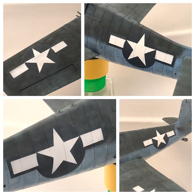
So after a small snafu with me trying to cut my own masks for insignia, I was able to correct things after a patient wait on some montex masks through the mail. Should’ve just done that from the beginning. It’s very tricky to get a taped masked you make yourself to contour around the curves of a fuselage. Some planes make it trickier than others. Montex takes the guess work out of it. They’re so pretty. Anyhow, here’s the results. Couldn’t be happier.
 Untitled by Britt Vallot, on Flickr
 Untitled by Britt Vallot, on Flickr
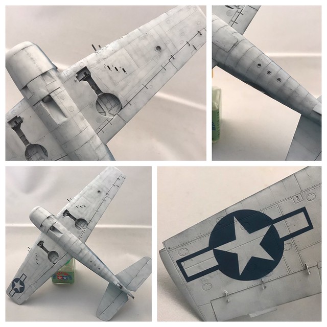
I’ve included a couple other pics of the corrections I needed to make for cleanup underneath.
 Untitled by Britt Vallot, on Flickr
 Untitled by Britt Vallot, on Flickr
 Untitled by Britt Vallot, on Flickr
 Untitled by Britt Vallot, on Flickr
 Untitled by Britt Vallot, on Flickr
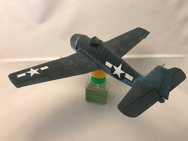
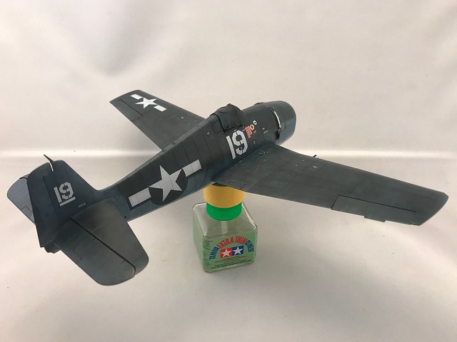
I tried to fade the top wing insignia just a little. I didn’t want anything too worn. By the time the repainted the red outer border to blue later in '43 this new color would’ve still been relatively new by the time of famous “Turkey Shoot.” To be honest to get the color of the Insignia Blue the way I wanted it was done in about 3-4 very light coats to get it to act right with the Sea Blue next to it. Started with a base coat and went darker, and then added a faded coat to tie it in with the paint around it.
Because of my concern with my clear coat taking away from the subtlty in colors going on here, I put down a very thin coat of Alclad’s Aqua Gloss. In the past, I’ve seen where I’ve lost a bit of detail in my paint and had to put it back with added weathering later on. I originally intended to paint the numbers on as well, but I honestly just didn’t have it in me to fool with…especially on time. Plus, these Cartograph details are just about as good as good gets so I opted to use them. They are remarkably thin. Also should point out that it’s been a while since I’ve even used a decal this big! I had a little trouble in the beginning… a little rusty. I did my best to use only the decals that are visible on Vraciu’s hellcat.
 Untitled by Britt Vallot, on Flickr
 Untitled by Britt Vallot, on Flickr
You can easily see the difference in the stark white of the numbers versus the painted on insignia. I don’t mind this here because there will be plenty of weathering directly over this area which ought to sufficiently dirty it up. =]
 Untitled by Britt Vallot, on Flickr
 Untitled by Britt Vallot, on Flickr
That’s that for now. I’ve got some decisions to make about weathering underneath and bringing out some detail with the riveting along the wings and fuselage.
Questions, comments…hit me. =]