I need to make a decal of HMS Victory’s name, to be placed on a dark blue background of her transom. I tried to use Testor’s clear decal paper and Canon bubble jet, but the resulting yellow lettering is too transparent and becomes nearly invisible when placed on the dark blue background. White decal paper also does not work because it is impossible to cut the decal precisely along the edge of the lettering and the surplus white background forms an unwanted white border around th lettering.
Does anyone know of any way to make decals that would allow light colored lettering to rmain clearly visible on a dark background?
If there is no way to make such decals using aftermarket decal kits, is there any source for pre-made yellow 28 pt Centuar letter decals that I can use instead?
Thats a great method, but dont use the font mentioned - its way too modern, and totally incorrect for any ship of that time.
There are plenty of fonts mentioned which will look much better - look around the font file of the computer used to make it, test out a few, and be sure to keep it conservative.
Also, Woodland Scenics sells dry transfer lettering, in traditional styles. I saw it on a model of the schooner Ghost, and it looked very sound and realistic. I’m sure they make lettering in yellow to match Victory. - Jim
I use WordPerfect rather than Microsoft, so I don’t have a sample of the font in question. But here’s a link to a sample of the traditional Centaur font (note the spelling) : http://www.fonts.com/FindFonts/HiddenGems/Centaur.htm
They’re similar but not identical. The most conspicuous difference seems to be the direction of the slant on the serifs on the crossbar of the T. (In one case the serifs on both sides slant in the same direction; in the other they both slant away from the centerline.)
How much difference that would make on a 1/100-scale model is best left to the individual modeler. I suspect at least one of the dry transfer or waterslide decal companies offers something closer - but maybe not. Micromark (www.micromark.com) just added a mass of new dry transfer sheets, including some yellow ones, to its website; that might be worth checking out. Click on “new items” on the left side of the screen, then page through the assortment of railroad stuff till you get to the dry transfer sheets.
I also wonder just how certain the people responsible for the current lettering on the *Victory’*s transom are that the font they used is absolutely authentic. I rather suspect a little guesswork may have been involved there.
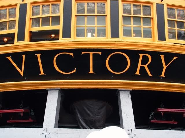
That photo of the transom is a beauty. The lighting is such that lots of interesting details are visible. I wonder, for instance, how many models - even on large scales - reproduce the differences between the windows. The ones on the lower (wardroom) level apparently have two sliding sashes apiece (with the upper row of panes in each window remaining fixed), whereas those in the upper two rows (Nelson’s and Hardy’s cabins) are hinged. Heller missed that one; I’m pretty sure C. Nepean Longridge did too.
Later edit: The more I think about those windows, the more curious I get. The lower sashes on the bottom row can’t slide vertically - because the whole window structure is tapered. But the bottom row ones clearly are built differently than the others. I’ll take another look at Mr. McKay’s book, but I don’t think he covers that particular little detail.
CODY614’s photo is fascinating for a couple of reasons - especially when compared to the one on the ship’s website.
In regard to the “name font,” it seems to establish that the lettering has been changed at some time fairly recently. In one photo the lettering itself is much bigger - and the yellow frame around the name has disappeared. The fonts also are different. In addition to the changed angle of the serifs on the T crossbar, take a look at the top of the R. In one photo it’s straight; it the other it’s slightly, but distinctly, curved.
I wonder why the change was made - and I wonder which photo is more recent. The ship underwent an extensive restoration in the years leading up to 2005, and a good deal of sophisticated research was done to get her back as close as practical to her 1805 configuration. I have no idea when the picture on the website was taken; it may have been there for years. My intuitive guess is that CODY’s photo may postdate the recent restoration. CODY - do you have the date for yours?
Obviously the bottom sashes of the wardroom windows do open by sliding up. That means the geometry of the windows is a little different than I thought. I don’t have Mr. McKay’s book in front of me at the moment, but I did check George Campbell’s drawings - the ones that are reproduced in the Longridge book. Mr. Cambpell’s shows the bottom row of windows as near-parallelograms - i.e., with the “vertical” sides (which, of course, aren’t really vertical) straight and parallel. (The tops and bottoms are slightly curved.) It would be possible for the bottom sash of a window like that to slide all right (though I sure wouldn’t want to be the carpenter responsible for building it). Mr. Campbell doesn’t show any difference between the construction of the bottom row and that of the other two; there’s no indication on the drawing that each window in the bottom row has upper and lower sashes, whereas the windows in the other rows don’t. In an elevation view of the transom that’s a mighty small detail; maybe he just missed it. Or maybe those windows have been modified sometime during the twentieth century. (If I remember correctly, the first time I visited the Victory, in 1978, some major work was being done on her stern. I suppose it’s possible that the windows were rebuilt at that time).
For what it’s worth, Mr. Campbell shows the ship’s name surrounded by a frame, and in the same font that’s shown in the photo on the ship’s website.
This is the reason for the differences in the name arrangement on the stern of Victory.
An order was issued in 1771 that ships should have their names painted on the second counter, in letters a foot high, and be enclosed in a compartment.
The order was amended in 1772 and names were to be painted without a compartment in letters as large as the counter would permit, this was the fashion at the time of Trafalgar.
Whether all ships were changed to reflect this order, or over what time scale the change was made is open to conjecture.
The painting by Pocock of Victory shows the name without a compartment
The real Victory has had her name format changed to reflect the 1772 order, but for many years had the name in a compartment as moulded by Heller on their model. Even the celebrated model by C.N. Longridge shows the name within a compartment.
The practice of painting names on the stern was dropped after about 1815.
I have gone with the current thinking about ship’s names and have modified my Heller Victory to reflect this.
ps> the stern photos on the Official HMS Victory site also show stern davits, which are not currently fitted as apparently recent research suggests that they were not present at the time of Trafalgar.
It seems the official site needs to update their display photos!
The stern gallery frame timbers certainly seems to converge towards the top to conform to the general tumble home and the truncated triangular shape of the whole stern gallery structure. But the actual frame of in which the sash windows slide may have been shimmed and made to be parallel to enable the sash windows to open.
Incidentally, if one looks at the current stern name carefully, especially in a photograph taken from the quarter, one notice that while the transom in general clearly shows seams between three strakes of planking, the actual space occupied by the name lettering is smooth without noticeable seams. It looks like underneath the name, the actual planking has been covered by something. I am wondering if the original cartouche name is in fact still there, and is either planked over or filled with some filler to enable the new name to be written over them.
Asking a fellow modeler at the ‘Victory model site’…
His answer was…
"GeorgeW seems to have summed up the situation as I understand it.
I think the name change on the stern took place sometime between 2000 and 2005, in preparation for the 200th anniversary event, and reflected the new research that is currently ongoing.
Major stern repair work was undertaken between 1973 and 1980 but the 'compartment ’ name was still in situ when I visited her in 1987.
I’m not sure that Chuck’s idea about planking over the transom leaving the previous name plate intact beneath it is correct. I may be wrong but I didn’t detect any shadow of an image beneath the current lettering when I examined it closely last year.
The lines between planking on Victory are not very distinct, she has quite a smooth look to her, and this applies to the sides as well as the stern.
Still I don’t think we should get too hung up about the precise ‘at Trafalgar’ look as far as the model is concerned. It’s not just the Entering port, or the name format, the Prince of Wales feathers on the stern are definitely a post Trafalgar addition, and by all accounts the foc’sle bulwarks were built up and the Poop rails covered with boarding.
I don’t think the absence of any of these features will detract from the fine model that can be made from this kit."
I hope he is not offended that I post his respone here…[:I]…
I can only claim a basic knowledge of the HMS Victory. There are others who have alot more insight than myself. I have been interested in her for years…It is only in the last year that I have really begun to reasearch her to a point of being able to model her with any accuracy. And that is always changing with…“Wow…I learned something new today!”
I meant the font used in the photos featured in the first link (in the second post on this thread). It dates to the 1970s or 80s, and would be too modern and light in proportion. The “Centaur” font is closer to whats currently on Victory and acceptable for models.
Its interesting that contemporary models show entirely different styles of lettering, such as Bellona, Agamennon, or even Fair American. It is heavier, larger and often includes a period at the end of the name, which was common at the time. This style is also similar to painted signs and printed lettering from the late 18th and early 19th century.
Sorry about the confusion, I should have specified that the anachronistic font was in the linked photos.