I have a question. A belgian ship historian and oil painting restaurator once told me that building instructions (for 16th/17th century sailing vessels) calling out for large amounts of blue and gold paint should be regarded as fiction.
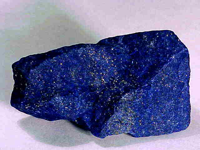
As he explained it to me the 17th century era gold paint involved actual gold in it so it was extremely expensive and hardly used. Same goes for the blue paint which, according to him, was pigmented with something called “lapis lazuli” wich had to be imported from far away making it even more expensive. I always assumed his information to be correct.
Doing work on Wasa by airfix i encounter vast amounts of these color callouts which makes me wonder about some stuff…
Is what my fellow modeler and ship history guru stated true? And here’s another question:
Considering that richly decorated flag ships like the Wasa were a nations maritime pride and a floating businesscard with no expenses being spared during the construction, wouldnt it be logical to assume that the use of these paints were implemented anyways?
Looking at pictures of the Wasa model inside the museum overthere i see little to none of the gold paint but i do see use of blue paints…
Just a thing i have been wondering about for a considerable time…
We now know that Wasa was actually painted red not blue on the upper part of the hull, and the carvings were not painted solely in gold but were painted in many different colors such as flesh tones, greens, blue, etc. The lower hull was left bare wood. There is a wonderful picture of a model of Wasa showing the stern and port quarter on the cover of the Sep/Oct 2010 Ships in Scale.
According to current research on the Wasa, there was no pitch color used below the waterline, either. It was left its natural wood color. So, it seems that your acquaintance is at least partially correct about ship colors of the 17th century. But, I would be sceptical about stretching his points too far.
For example, if you consider the Berain paintings of Le Soleil Royal, the ship was painted mostly in a shade of blue. Since Berain was responsible to Louis XIV for the decor of the King’s ships, I would consider him a reliable source. Consider also that contemporary Dutch sources referred to the British Royal Sovereign as “the golden devil”. By all accounts, she was richly guilded in gold painted carvings. Note also that subsequent British ships were less guilded; Prince was decorated very simply by comparison. One factor could be the individual wealth of the ship’s captain and precisely how ornate he wanted the ship to appear.
So, the correct answer seems to be that it depends on the ship and the period in her career that the modeller is modeling.
As an aside . . . I am really looking forward to Revell’s release of Wasa later this year!
Prior to some time before the mid 18th century, warships were as much to impress opponents as to actually fight them. The ships were very expensive to build and guilding didn’t really add that much to cost. Gold leaf is incredibly thin, and hence not a lot of gold was involved. Further, the major warships were commanded by quite wealthy men, and the captains frequently subsidized the guilding and decorating. During the 18th century things changed. The economy changed, making governments/soverigns more concerned about cost. Further, there were changes, at least in Britain, in naval administration (the Anson heritage) and naval promotions became more to do with merit than status. As a result, guilding did seem to be reduced and yellow paint began to replace guilding. This was not as true in French ships until their revolution. Don’t know about other European ships. American ships, of course, were on a strict budget, and the lack of fancy decoration was always more in evidence. Carving, of course, was common whatever the country- apparently wood carvers were common and not well paid.
If you read books like Hornblower you often hear references to the scandal of the decoration on Royal Sovereign. But one must remember that this refers to the Royal Sovereign of King Charles I! That refers to the 17. century as this thread does and not to the later ships of the same name.
The ultramarine colour was as correctly stated very expensive. Later on one got cobalt blue which is just as stable, but lighter in colour and very cheap to make.
Gold leaf was not only replaced by yellow or ochre, it could be replaced by almost any color appropriate to the carving. For example, one reference in my collection states that the carvings on Le Soleil Royal were at one point painted white. Also, the reds and blues found on 17th century ships gave way to black, a much cheaper paint to produce.