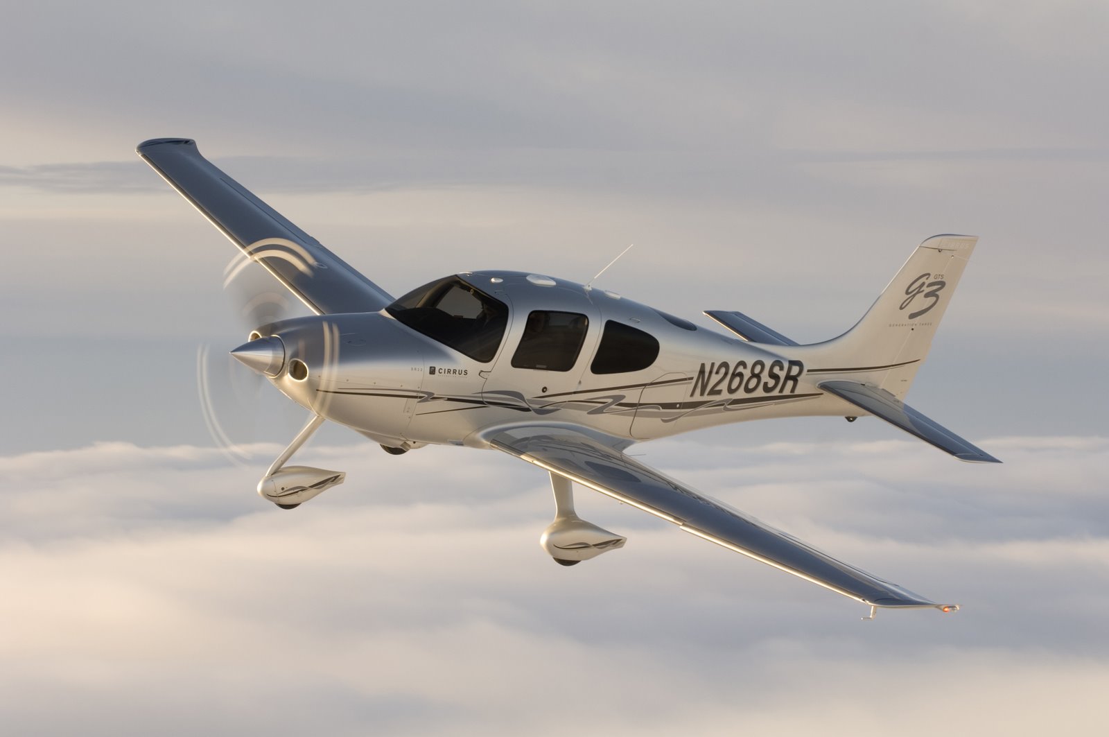
Did the FAA ever require a specific font for the registration numbers? I notice early markings, say before the eighties or so, the numbers all looked the same from plane to plane. If they did, does anyone know what font it was? I will be making homemade decals for my D-18 project and want to get the font right.
Hi, Don - I heard mentioned once some time ago that many, or maybe most, A/C paint shops used templates for laying out N numbers when refinishing. I saw a template set once at a shop that specialized in restoring Stearman and Waco airframes. They appeared to be brass, had the rolled edges for connecting in series, much like the sets all military bases used for stenciling everything.
As I recall all letters and numbers were angular, no curves, all vertically oriented. The figure “8” was composed of a series of 45 degree angles, the middle of the 8 was a 90 degree angle. A friend and I owned a '65 Comanche 250 with factory paint, those were the N number style that were on it. Then we bought a 210, it had the more modern curved numbers that you still see on Cessna’s today.
For scale purposes I believe they were 12 - 14 inches high and the dimension of the line stroke was 2 inches I think. Perhaps a Google search for “Aircraft registration masks / templates / decals” would yield more info. Hope it helps.
Patrick
There is no “approved” font for registration numbers… but there are some requirements as far as size and relative width and height - check out this link for the info.
Most US aircraft have 12-inch numbers, but some older aircraft may have much smaller 2-4 inch numbers.
While military-style “block” fonts may be common, they certainly aren’t required:
Hope this helps!
I still would like to find a font to use, that I guess could be the one used by the military. My search for stencil fonts seems to only find those where the segments have spaces between them, which are not what the font I am looking for looks like.
Patrick, did those stencils have the sections connected (say, the centers of eights and nines) by bars that would leave open areas, or how were the center areas connected?
Draw decal has a sheet that provides a couple of different fonts, in black and white:
I posted the 1/48 version but they have it in 1/144 and 1/72 as well… Is that similar to what you’re looking for?
Don, I think I didn’t describe the stencils well. What the shop was using for Stearman classic N numbers was only intended for connecting and orienting the characters on the A/C, then pencil lines were traced inside the borders. There were some tags that held the edges together, like on PE. When the tag created a blank spot, it was simply replaced by ruler and pencil to fill in when stencil was removed.
Once pencil lines were neatly completed, the masking tape was used for laying out the masking, then paper sealed the areas not to be painted. So the stencils were not intended to actually mask for painting, only for layout.
I understand that N numbers now are available in decal form, actually considered quite durable, but make sure it’s set in the right place, they’re self adhering and not repositionable. Hope I didn’t mislead.
Patrick
Check out “Amarillo USAF”. It’s a version of that old 45% football number looking thing.
Since I find inkjet decals easy to make- much easier than measuring the space available and trying to find available decals- I am looking for the font in a computer file, not decals.
I will look at that Amarillo font.
Don, the rules for US registrations used to be very specific. I don’t think there was a named font, rather the width of a stroke was defined as 1/6th of the height and letters were 2/3 of the height in width, except the W and M.
There is a font that is used by the USAF that is based on these rules called Amarillo USAF and is available from Tlai Enterprises that can be used in graphics and word processing programs.
Here is the page from my Northrop book from A & P school in the 60’s. There were rules changes several times in the 60’s and later that changed locations and sizes of reg numbers, and allowed artistic changes like slanting and rounding. I know of some variations in font prior to that but it was very uncommon and I doubt it was completely legal. The Aeronca LC was one example but even in that case the stroke, height, and width rules were adhered to.
I downloaded that Amarillo USAF font, but cannot seem to get it installed. After unzipping, I think the actual font is the .ttf file. I have a book on Windows 8.1, that says just drag the font file into the folder with the existing fonts- that doesn’t seem to work. And- I notice the existing files in the font folder are not .ttf files!
Don, did you put them in C:\Windows\Fonts? I use copy to instead of dragging, don’t know if that makes a difference. I looked in my Fonts directory since I am also using Windows 8.1 and some fonts are ttf, others are not. ttf should work.
Hey, I got it. At first the computer was saying I could not copy anything into that folder, but somehow I finally managed. I tried it in my graphics program and it works! Thanks, guys.


_07.jpg)

