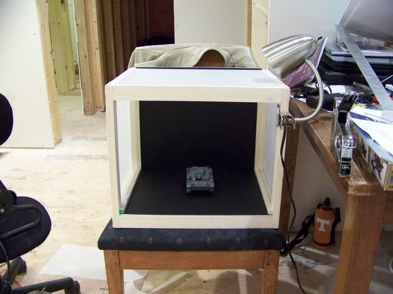
Well, as a diversion from modelling and inspired by Bill’s post a while back about a simple photo box, I decided to try and build me one today. Started out with some 6’ 1"x2"s and built a simple frame using a Kreg jig. Those into woodworking im sure will know what that is, one of the best tools I have in my arsenal. Went to Hobby Lobby and picked up some blue and black foam board that was 50% off and some drafting paper that has a opaque look to it. Cut the foam board to size for the floor and back wall and stapled the drafting paper to the top and both sides. Also, the misses, I do love her so, agreed to buy us a new digi-cam so I have gotten to play with it a bit with the new box. Im still figuring all the settings out on it, but here are some test shots. Tell me what you think? Black or blue background? Any tips on the photography itself? Thanks for looking!!!
First the new box…
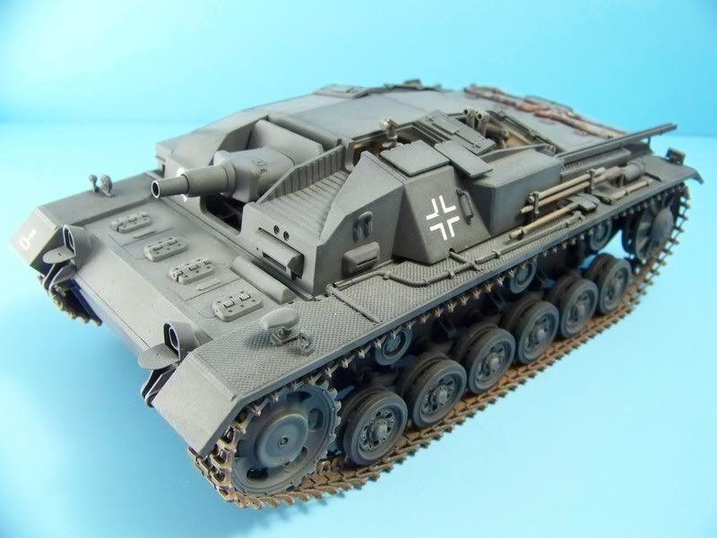
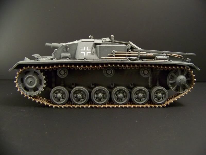
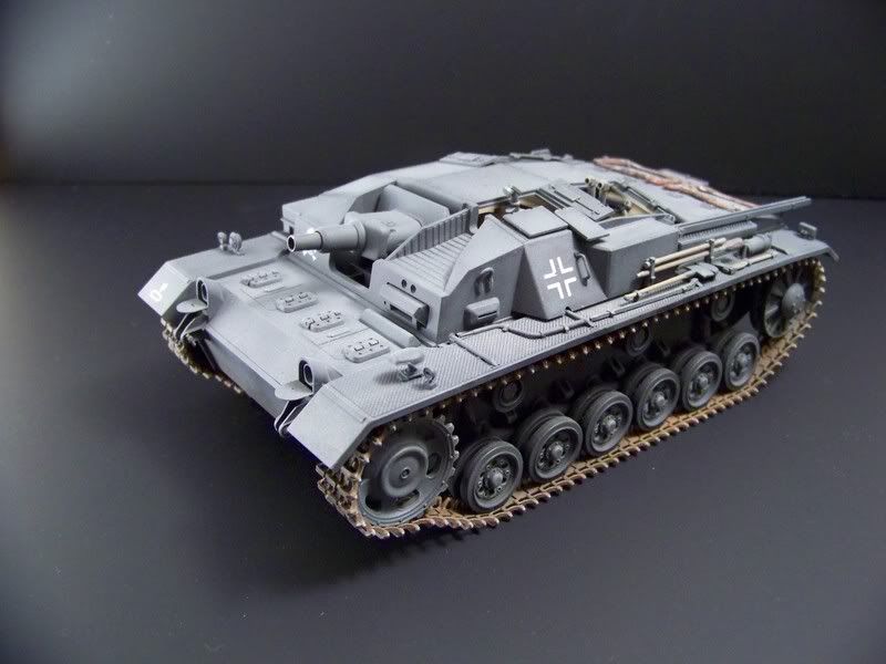
And the test shots with my favorite test subject. First the blue…
Thanks MR, Eric. I saw that track, it just got kinked up some how when I was posing it for the pics. Those are the workable MK tracks so a little jiggle and it went right back to normal. As far as the camera, we bought the Kodak Z712 IS. Lots of advanced settings and pretty good price too.
Hey Jester, nice box… are those photos taken using just the one lamp as seen in the first 2 photos, or did you set up more? Been thinking of this, too, since I saw that article sent by Bill.
I actually had 2 lamps set up. One was set up on the other side and was sitting in a chair! The article that Bill posted is where I got my inspiration to do this. All in all I spent about 25 bucks on everything and spent a little over an hour building the box.
In regards to the color of background, the grey is more dramatic, but tends to hide detail. I vote for blue myself, but offer that you should find a darker tone. The sky blue is too light IMHO.
Also, try to find a piece long enough so that it will act as both the floor and the back wall. You want a gentle curve, instead of a line which detracts from the photo.
Thanks for the comments! I like the black a bit better than the blue myself. I tend to agree that the sky blue is a bit too light though and will probably go back and get a sheet of a darker blue they have.
Also, will be hard to get rid of the line, the way the box is built, the bottom slides in, and then the back slides down inside of two slots on each side. Will have to be creative and find a way to hide the line in the back!
To hide the line, just use a single sheet of posterboard (it’s thin enough to flex to a curve), and slide it in and out of the box as needed when shooting. This is what I do in my light tent and I have 3 sheets (1 black, 1 white, 1 blue) that I’ll use for different subjects depending. I’ve found that my particular camera prefers the blue above the others, each camera is going to be different.
One other thing for you to consider is the direction and intensity of the lighting. Try to not have any of the lights shining directly on the subject but rather off to an angle and illuminating the box itself. This creates good back lighting and will reduce some of the stark color you’ve got with the blue background. The other factor for you to look at is your camera’s white balance, see if you can play with that to reduce some of the brighter effects you’re seeing with the blue background.
Glad the article was of some use to you and others, in the online world the photo is the model! [tup]
Here’s what I mean about the lighting and the poster boards.
I gotta say that I’ve had just terrible results with blue backgrounds–and you’ve all seen my other photos against the white backgrounds, they come out alright–but I think that the blue backgrounds, for me anyway, tend to somehow reflect onto the model and tint the perceived color of the paint. Look at the difference between these two pics of the same model:
Isn’t the Blue background FUNKY?
Have you tried a neutral off-white background? I think that the way the light bounces off of the white lights up the model in a more even way, without weird tints like the blue seems to throw…anyone esle agree?
I agree, I liked the black better of the two, but like Doog said off whie would show the model more natural. Something to experiment with, especially with different color vehicles. Real nice job on the box Jester. Thanks for sharing[tup]
Great work on the photo box Jester, wish I had one![:D]
My [2c]: The blue shows more details, but the black has better color balance. I have to agree with doog on the blue background. Using it causes a color shift that needs to be compensated for. White is OK too, but a white background will be gray in the photo unless it is lit separately. I like to use black when photographing unpainted models that are in light gray plastic.
My[2c] Like the overall look of the black - if you’re going for a framed print. Otherwise the blue is better.
I think I read a couple of comments about finding a slightly darker shade of blue - I agree. Also, I think you need to difuse your light a little more. Right now, you’re geting a whiter hue on the left side, I suspect that is where the bulb(s?) was shining. Bill suggested aiming the bulb back a bit more, I think you might want to go to a lower wattage bulb that is color corrected/balanced. I know Home Depot has 'em so they must be just about everywhere. They might cost a few cents more, but you shouldn’t get as much light shift.
There’s no one magic answer in digital photography…I’ve owned several different digital cameras and they each had their own “sweet spot” in terms of best lighting, background, etc. combinations. Some preferred white, some blue, black rarely worked well though because it creates such a wide color disparity and “sucks in” light due to it’s nature.
Doog’s photos highlight how much of a difference indoor vs. outdoor lighting can change things…especially if the camera settings used aren’t any different under both lighting conditions. Natural light vs. indoor light behaves radically different due to it’s different wavelength and color properties. A digital camera “sees” what it’s programmed to see…and in some cases you can modify that, others you can’t, depending on the sophistication of the camera and conditions involved. Purists will tell you that natural lighting is always best, but it’s also the hardest to predict/control for the obvious reasons. Indoor lighting allows greater flexibility and control but produces its own issues as well, since it can be harsh and create its own color distortions. Most medium range cameras have the ability to correct for white balance due to this fact, but not all. Using incandescent lighting vs. halogens vs. fluorescent is a factor as well.
The main benefit of a light tent is to create an even lighting set-up that diffuses the light…so if you can position the light sources effectively to do this, you don’t need high-power bulbs as IA points out directly on the subject. I use 4 lights in my set-up, two front angle, two back/overhead angle, and will adjust them as needed to avoid an angle glare. You want soft overall lighting with minimal to no shadows.
Once you’ve got the lighting down, then it’s a matter of testing the background and setting to see what works best. Take one variable at a time, work with it, and use your camera’s advanced settings to help with this. Also keep in mind that different people will see different things depending on their monitor settings…what looks great on one monitor can be absolutely awful on another.