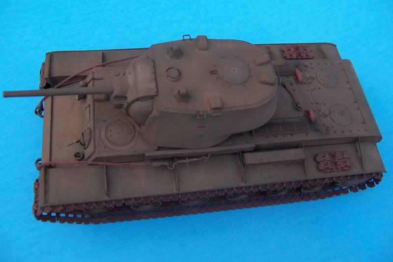
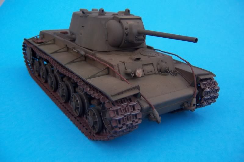
Just wondering what color do you recommend painting the KV-1 tank? Tamiya says Dark Green but I think it might be to dark. Any recommendation for brand and color and/or mixing of colors for desired effect will of course be greatly apprecaited.
Your bound to get many different replies. I used MM Dark Green, lightened with an OD overspray, washes and such. With Russian Green, the skies the limit as there seemed to be no real official swatch.
tigerman, I think that BRIGHTBLUE background really tints your shade of green in your photos quite incorrrectly from what you probably have there in real life; you should try to find a more neutral shade–that green looks really grayish, IMHO.
I had the same results with the same background. It looked much closer to actual color with a white background. Check it out…
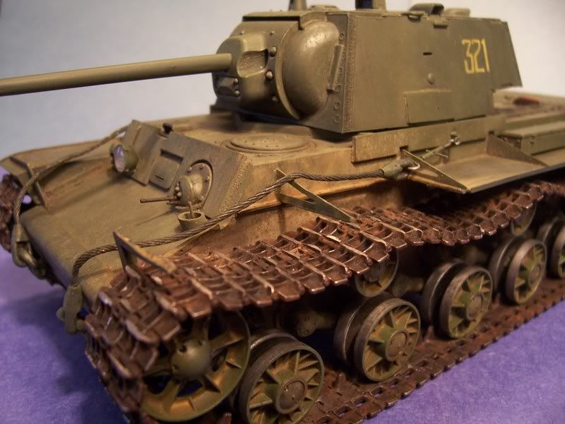
look at all the variations of Russian green over at the finished Kursk builds – all different-- all correct-- /forums/821693/ShowPost.aspx --tread[8D]–
Thank you Karl. I was kinda thinking the same thing myself. The green kind of gets lost in the blue background. I will purchase some white poster board then figure out how to use my new digi-camera and get some better pics.
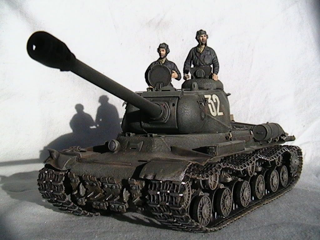
Hey Doog[:)]-- I rarely have a critique for anyone, but on my Trinitron crt monitor, your jsII(awsome looking) actually looks to be almost panzer gray to me,while tigermans kv looks much more green (although I do think the particular shade of blue backdrop is to intense) I really think a very pale blue background will bring green out much better than off-white-- here is what Russian green looks like to me, shot againt a ‘baby blue’ backdrop (I wish the bottom was the same color, but I only had 1 piece of that color construction paper-- tread[8D]
Hey Tread, agreed; your green is “greenier” than mine! [swg]
I’ve experimented with it a bit, and I think that it has a lot to do with how strong the light is when you’re taking the photos, and what KIND of light–sunlight, flourescent, “room”, --which affects the way that the light refracts from the background. That blue of yours looks pretty mild, though too; I should try that. The blues really seem to affect dark yellows more than greens in my opinion.
Camera settings also play a part. But I don’t know much about that! [%-)][:D]
White Balance settings (how it sees “true” white vs. the lighting)
Camera photo sensor/preference/bias towards the color spectrum
The first two are manageable depending on photo setup. The third can be figured out once you’ve got the first two under control. I’ve had cameras that preferred white backgrounds, others light blue, one that especially liked light gray…each camera is different in that regard depending on its capability and settings.
Also, as treadwell points out, monitor settings also vary so what looks great on one monitor can look awful or distorted on another depending on monitor type, refresh rate, settings, etc.