You’re sort of making the agrument for scale effect. The distance and difraction of light causes the the star to appear dimmer (essentially washed out). Put another way, the light isn’t piped directly into your eye from the source but spreads out over the immense distance.
The objects we are modeling are not emiting their own light, but reflecting light and perceived by our eyes. Over that distance, via difraction, moisture in the air, dust, etc., the light spreads out and washes out the color. That’s why a plane high in the sky or a ship on the horizon doesn’t appear black but a hazy gray. Obviously, these are extreme examples, sort of like the star, but are useful to demonstrate the scale effect philosophy.
Here’s my own take: I don’t consider scale effect when painting my models. For instance, like this morning, as long as it’s not a super humid day, if I go look at my car (doing so right now), I can’t tell much difference in color if I’m standing 1 foot away, 25 feet away, or 43 feet away (estimates as I move back). It pretty much looks the same. The caveat: To my eye. But maybe to you or someone else it does look different. Maybe you perceive desaturation of color and you want to model that effect. More power to you! But as I pointed out in the initial post, scale effect, if you model it, will be different depending on where you are in the world–Phoenix, Arizona, is going to be very different from Sao Paolo, Brazil. Humidity and particulates in the air very drastically from one local to another, and therefore your perception of this effect would be different based on it.
But hey, it’s scale modeling–an art–and there are no rules!
Oh! And here’s a discussion about scale effect on this forum from back in 2003: Color Scale Effect
You have that backwards. Look at a mountain range, or a series of hills, and you’ll see that the further away from you, the lighter the colors, or perhaps more precisely, the more washed-out or faded. The light coming from farther away is subject to more scattering in the atmosphere.
Exactly. Lighter is a misnomer. The colors become desaturated and washed-out. Which bring’s up an interesting thought: Instead of using white or light gray to “desaturate” the color, we should be considering the color wheel and using complementary colors for the job. I jest!
I would strongly agree with this, but I need to find my bulletproof vest first. Mostly I feel this way about panel lines, which should absolutely not be so dark I can tell they are on the model from across the room!
I’m a little the opposite here, but also agree. I like to do the research to find the historically accurate “exact” paint match, but I will lighten it up a little to indicate wear or fading or…perhaps some unintentional scale color effect.
Oh, Ghu, don’t bring this up - I spend forever researching color blending and mixing and this would just ruin any spare time I have to model…
Ok, in addition to scale effect, lets make the matter more complex. Paints fade with sunlight, and paint may weather in an uneven way. This is weathering. Do you want your plane to look like you painted a wall? Second grenade tossed.
Tim, an old man now, eases back in a rocking chair sitting on a dilapidated deck charred in spots, the only surviving construction of a house that’s burned down many years ago. “I remember when this was a nice place. A happy place. Before the troubles. Before … @tobyrudy10.”
As an armour modeller I’m not really looking for a finish that’ll sparkle like a diamond, so the vehicles will always be finished with a flat clear coat. So far this has almost always had the effect of desaturating underlying colour
Could it therefore be argued that this process ends up providing a modest scale effect at the end of your project rather than planning for It by lightening your base coats? Further, if you do lighten your base coats, does the act of applying a flat clear coat exacerbate your scale effect and wash the colours out more than it should?
While researching something else, what should I come across but a discussion about scale effect? I was looking in The Official Monogram Painting Guide to German Aircraft 1933-1945 (circa 1980), and it quotes Patrick Donahue, who, in turn discusses landscape painters John Constable and Winslow Homer.
Donohue says, “What … Homer and Constable knew so well was the fact that the atmosphere is not wholly transparent. We see things looking through a filter, as it were. Objects viewed from far away are not sharp and clear. As applied to aircraft, the smaller the scale, the further away the aircraft appears.”
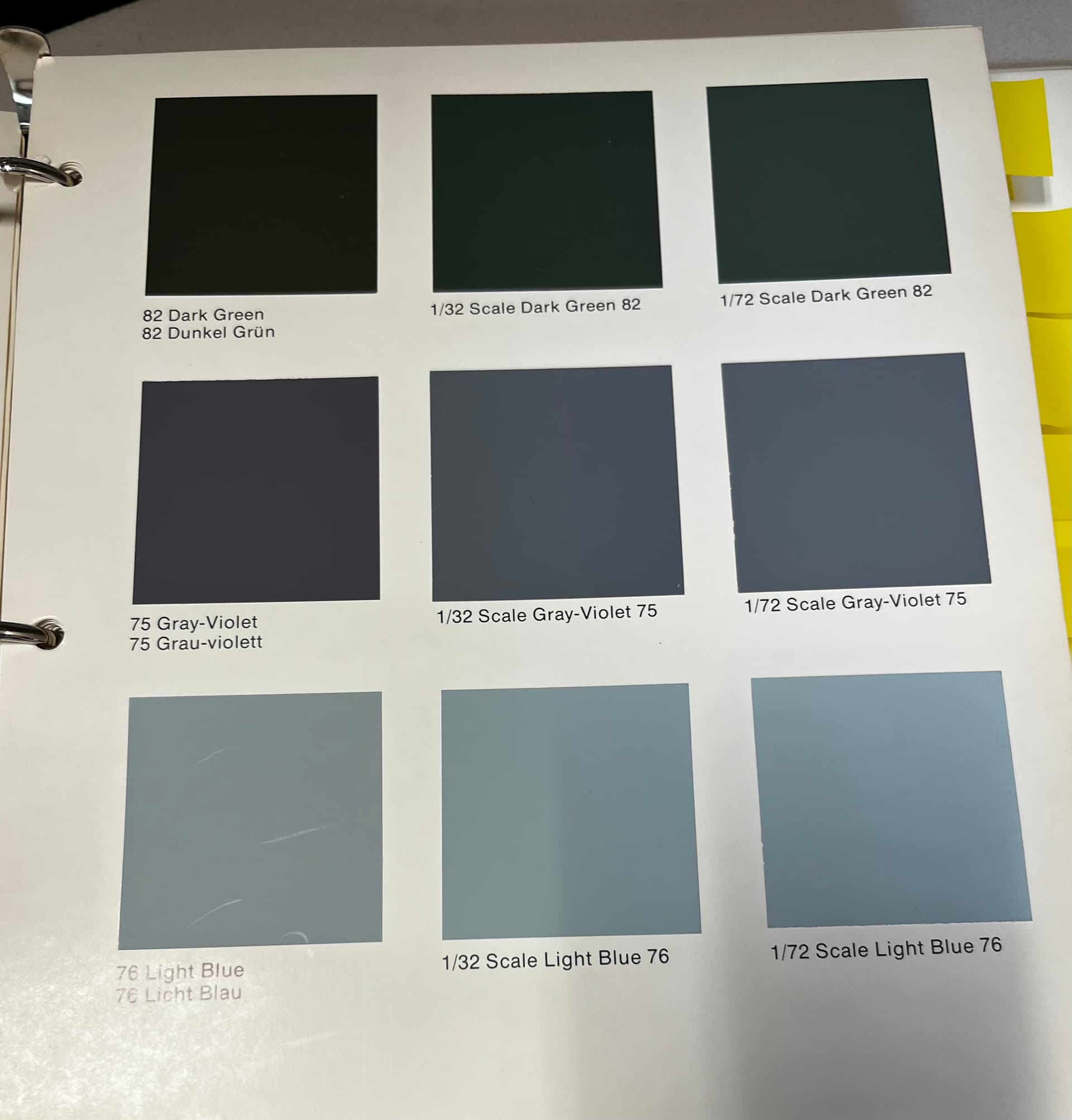
There is a discussion about using gray to desaturate the colors, but Donohue argues against it because so many camouflage colors are already “heavily grayed.” Instead, white is the color of choice. The suggested ratios? “Experiments show that it is not unreasonable to add 25% white to a given color to achieve the necessary scale effect for aircraft to 1/48 scale. Since 25% is about 1/2 the numerical value of the scale; 15% reduction would yield satisfactory results for 1/32 scale, while 36% reducton would provied for 1/72 scale.”
Interestingly, Donohue says white doesn’t need to be changed, but it is “desirable to break up whites with gray added here and there. Otherwise a monotone finish will result that may be technically correct but optically unrewarding.” I love this statement, because Donohue, in an argument for verisimilitude concerning paint color as seen over distance demonstrated via scale effect, he is admitting modeling is an artistic pursuit and much relies on the modeler and their envisioned result. But without slowing, he continues, saying pretty much the same for “aluminum surfaces.” Add a little gray (not white!) for better results. What of yellow or red? White.
I’d never read any of this before today, and I thought it a worthy addition to the discussion. Also, here is a page from the book with color chips designed to show the difference from the original color to the colors adjusted for scale effect. Not the best photo, but you get the gist.
Well, those 2 words kinda says it all for me. Anything done to a model that is optically unrewarding, I am skipping, no matter how technically correct. I mean, its a model.
Thanks for the additional context to this discussion.
I like this statement
he is admitting modeling is an artistic pursuit and much relies on the modeler and their envisioned result.
This is my issue. I’ve stated in the weather post discussion that I am an engineer and I build like one. Weathering and scale effects are more artistic, which I do not have that type of brain. I remember in high school band, I was a good technical trumpet player and they wanted me in the Jazz band, but that required an artistic playing style which I couldn’t do. Modelling is the same way.
But I do agree that scale affect is a thing. I’ve seen some models, especially in the smaller scales where the paint just does not look right and overpowers the build.
Not a scale effect person. It seems that if you want to have it work properly you would need to have the observer stand a distance from the model, as the above measurements stated about a foot or more away from the model depending on what percentage you lightened the paint. This is like saying, here is my 1/48 scale spitfire with **% scale effect. Please stand here at 16 1/4 inches away from the model to observe it. Plus it was a misty morning so let me spray mist between you and the model. TA-DA!
You shut your mouth @Tim_Kidwell1 and don’t ever bring this up again. (joke )
Ok, serious response here…
I do not subscribe to the scale effect with painting. HOWEVER I do lighten up the colors a little when painting my car interiors because they are inclosed in a small dark space once the model is all finished up. The lighter shades of paint will hopefully allow the details to show better.
I do not use scale effects, except sometimes on large ships. While sometimes there is a theoretical reduction of the contrast ratio, at the scale viewing distance of tanks, aircraft, cars and such, it would have to be a really foggy day to get that much CR loss.