I thought I’d share an interesting bit of news via one more post before going off for the holidays.
As a result of extensive scientific research, including both spectroscopic and chemical analysis of hundred-year-old paint samples taken from the timbers of the mighty ship, her latest “make-over” will leave her with stripes not of the traditionally depicted yellow ochre but rather of a color described as a sort of faded light peach…or, on more inclement days, as pastel pink. The same program will recolor the gundeck interior bulwarks and the great cabins for the ship’s captain and fleet admiral in baby blue. Such is now believed to have been her livery when she broke the French line at Trafalgar.
The new suit of clothes for the old girl has proven something less than wildly popular with the UK general public, according to some friends on that side of The Pond. Modelers who have complteted a Victory clad in the former black-and-yellow ochre are said to be aghast.
Yes Ray, I’m not too enthusiastic about the color they’ve decided to paint her. I’m not so sure it represents the exact time frame of the Napoleonic Wars when Nelson used her as his flagship.
I’ve read elsewhere that His Majesty’s Royal Navy used whatever color was available at the time so, perhaps they’re correct, perhaps not.
I’ve often wondered why so many warships in eigtheenth through twentieth centuries used some variation of what I’d call buff color. I know in some cases particular colors were the cheapest available, like barn red from iron ore. Was buff a cheap color, or was that just what you painted a ship? In late nineteenth century it was so popular, especially for funnels!
Buff, or perhaps we should say “yellow ochre”, was dirt cheap. Literally - it was based on a kind of soil or clay. I have a short pamphlet by Boudriot listing the prices of various kinds of colour pigment used in the French Navy, ochre - whether red or yellow - was at the very bottom of the scale while Preussian Blue was at the top at about 45 times the cost per pound. Even black was twice as expensive as ochre.
I had always understood that the interiors of the sailing fighting ships were painted red to minimize the shock to the sailors of seeing blood sprayed around during battle.
Thanks, that makes a lot of sense. I suspected something like that. And as to Amphib’s post, I had for years also heard of the blood thing, but read someone else’s opinion that it was a cost thing. Same reason virtually alll barns were red. Like ocre, any place that had iron-rich soil provided a nice red. Red iron oxide paints, and charcoal black paints, have been popular since pre-historic times since they were so easy to obtain.
I could just see the reaction and conversation that would have happened the morning they were to set sail:
“I must appologize Captain Hardy, but maybe if the Admiral arrives before first light, he won’t take notice to the color. This all came about because we required 400 gallons of Yellow Orce, but the only paint the yard could muster was 290 gallons of white primer and 110 gallons of red primer, and since you ordered the painting to commence at all costs and us to sail with the morning tide, we had no choice sir.”
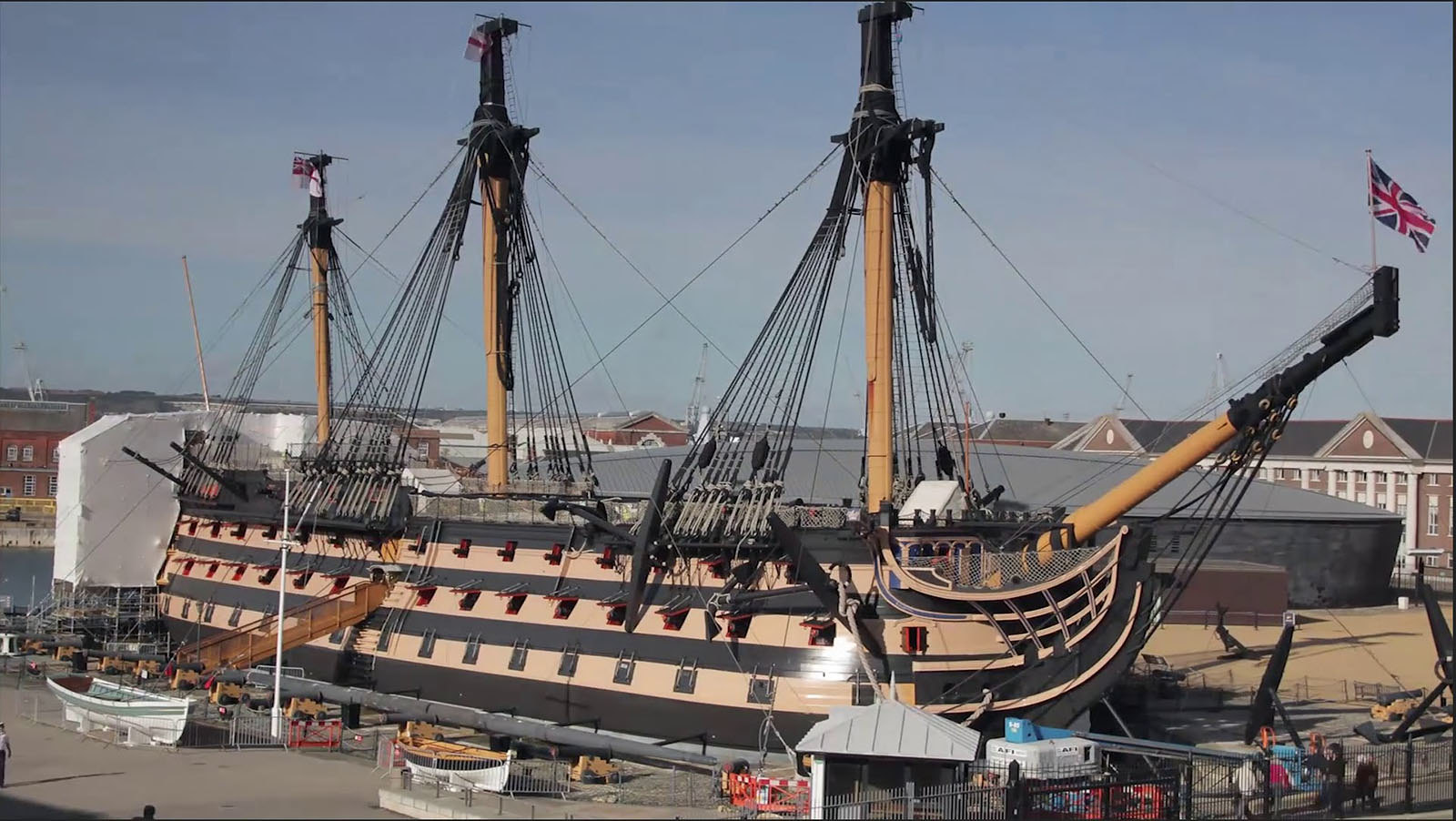
Beyond the color snafu, I didn’t realized she’d had her mast cut down so much. Ugh! The pain in my heart to see such a beautiful lady violated all the way around.
Yes, thats why shes getting a paint job. If you look at the photo, you can see where the stays and shrouds for the topmasts are hanging down in bundles from the tops, and the mast heads are all wrapped up.
I also will admit that IF I ever “finish” my 1/100 Victory, this is about how she’ll look.