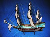
Here Is my Soveriegn of the Seas ( Lindburg packaged it as Blackbeard’s Pirate ship). Yes the flags are not on it as I am still looking for period flags then will have to play with the image once i find them.

before the rigging was put on

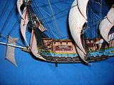
Stern Detail

thanks for sharing. i’ve been thinking about building this kit myself someday.
Interesting color selection . . . is it historic?
Bill Morrison
@ Bill no the colors are based on a few ideas. The black hull is based on the fact tar is fairly water proof, while for the period ( cirrca 1630/1640’s) paint of the time tended to wear out quickly. Yes I have seen the white hull line but wonder if that is more artistic licence to help show the difference between the water and the ship. The blue is my choice, the box had it as a dark almost navy but I thought the sky would look better. The marron/blood-red on the inner hull walls comes from references that many a captain painted the inner hull this way to hide the blood spatter of the wounded. The grass green on the top rails was to add more color and felt a contrast would look better. The decks were to look “HOLLYSTONED” the masts are white because that is what I saw on most tall ships, Varnish of the time would also not have been real weather worthy, and white is fairly cheep and easy to make for the time. According to wiki she had extensive guilding " The gilding alone cost £6,691, which in those days was the price of an average warship." more is here http://en.wikipedia.org/wiki/HMS_Sovereign_of_the_Seas. The two black lines with white rub rails was to break up the starkness of the brown hull. I read somewear that captains had the final say over how to paint their ships so took that into account.
Whilst the basic colouring of a lot of British 17th century ships is fairly well known through nautical illustration, the decorative schemes in Europe as a whole have indeed been proven to be very colourful. (although your Blue is traditionally associated with the French![:O])
Like Roman villas and Medieval cathedrals, I think the modern observer would be suprised to find naval ships of the early-modern period a little garish and tasteless for modern eyes! Some natural pigments can be superbly vivid.
Will
Looks good Brother! Now that’s an accomplishment! Lots of fiddling when it comes to any sail ship! The other photos in the photobucket set are cool too!


