Love those Mike! I can do a decent job on faces sometimes but have big problems doing it on a consistant basis- well I can always paint over them at least!
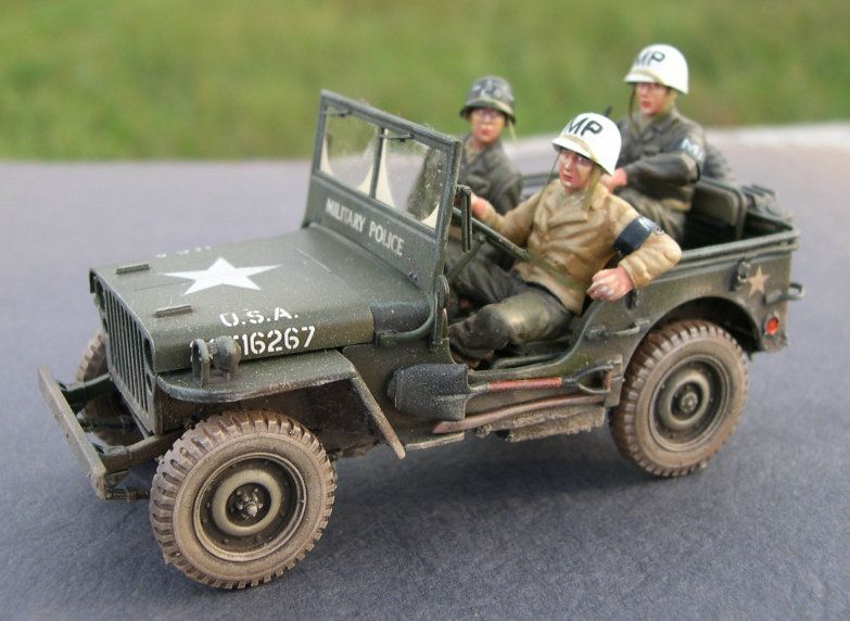
Hope you don’t mind but a few I’ve done. The three figures on this Korean War Jeep are Frankenstein’s Monsters assembled from the figure that came with the Jeep, MiniArt Second World War figures, assorted Tamiya parts, and the only legs I could find to fit for the guy riding shotgun were from an old Tamiya Kubelwagen so I modified the pants to a more G.I. style. Shotgun guy also got a Hornet ‘East Asian’ head as I intended him to be a South Korean interpreter. Looking at the driver now I think I could have used your technique of cutting under the collar etc to add a lot more defination.
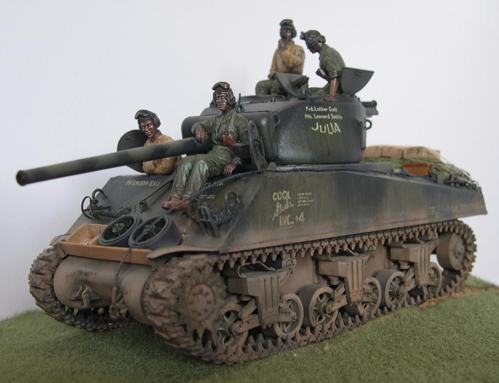
MiniArt figures where I replaced the heads with Hornet ‘African’ heads for troops of the 761st Tank Battalion, the first of several segregated black tank units to see service with the US Army in the Second World War. The lighting made everything shiny for some reason, guess I should dig the kit out and hit her with more matte varnish.
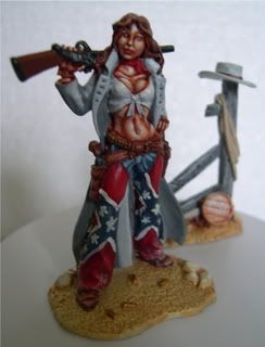
And just for the halibut a 90mm pewter cowgirl I did a few years back, guess her pants are a little non-PC now (sigh)…
Mike - thanks a lot, and I appreciate it! My goals were to fit the figs to the model, so that they don’t look “floating”, and at the same time to avoid seeing “the same guy” on every model I do - there aren’t this many Vietnam War figs around. Congratulations on your figures!
Gamera - so you’re already into modifying figs! You’re doing great! I especially like the tanker boys. When you say faces are tough, girl’s faces are a lot tougher still, IMO.
As for painting those faces I’d like to mention two things, maybe thay can help somebody.
First would be to avoid pure black and white on the face, especially the eyes. If you use dark grey and light grey instead, it’s easier to avoid that “horror stare” on the figs, and the face looks better IMO.
Second thing, that was suggested to me by ajlafleche, was to only paint the lower lip, and rather use dark brown than some pink/red hue here - helps to avoid that “lipstick” look.
I hope this helps somebody, thanks for reading and have a nice day
Also either only paint the “white” on one side of the eye, or make the degree of each side off balance. Otherwise he’s really staring at Gamera’s figurine. Those chaps not PC? I think they are right where they belong…
I slopped some skin base on my figs yesterday. I like the way that Testors Flat Tan looks as a mid tone to work from. Plus the enamel sticks like glue and I can safely layer my washes and highlights without worrying about lifting the base cote from the figure.
Nice figures guys! Gamera, that is some really fantastic work there. Of course I don’t mind if you show it lol.
I slopped some Vallejo dark brown wash on them next, gave them a mild scrub to get rid of the areas that built up too much, filled in some whites for the eyes, redid the blocking so I don’t have skin tones on my shirt collars, and then cleared it all.
From this point I will pen-in some pupils and shape the eyes, start layering in my highlights, and we’ll see what happens from there.
Pawel: Well, these were modified by just swapping parts around. I still haven’t tried using a wire armature and sculpting new parts around it to get the exact pose I want.
I’ve been using ivory for the 'white’s of the eyes, a sorta ‘dirty’ off-white. It might still be a little too bright. I haven’t tried a grey yet. And straight black for the pupils and irises, so a dark grey would work better? For lips I’ve been using a dark plum sorta of red on the lower lips, I’m going to have to try a more brownish red.
Today was the first day of school for my kids so I didn’t get anything done yet. I usually like to add a touch of pink or brown to my whites so they are not so bright. The camera always shows them to be much brighter than they are. But I have a tip for the pupils you guys may like.
I use a dried out Pigma .01 artists pen for a brush. I mix my eye color and simply dip the pen in the paint and “dot” the eyes in. I have a .02 for larger pupils depending on the figure and how much of the eye is showing.
I’ve found the best results have been to add a color in and then use the .01 to drop in the center. It’s almost an invisible effect in 1/35 scale though and you are hard pressed to see it even with the naked eye. I will be experimenting with higher contrast and see if I can get the effect to pop out better.
Using the dried out .01 pen is easier to use then a typical toothpick because the tip is designed to hold ink. Lining up where you want your pupils then becomes the hardest part lol.
Give that a try my friends. You’ll probably find it easier as I have.
Okay so I started with blocked in flesh base and whites in the eyes. I’m going to show you how I do my eyes and move on to “fleshing” out the rest of the flesh tones.
I use a Micron Pigma .01 artist’s pen that has run dry as my brush for the eyes. You’ll see how simple this is.
Keep your paint thin and dip the tip of the pen in it.
“dot” your eyes.
Then dot in the pupils. Bingo. It may take some practice to hit the mark where you want it, but like everything else it gets easier the more you do it.
Next I went in and painted in the eyelids. I use a very tiny brush for this as you can see in the picture.
Now they look kinda funny. Ah, yes. They need eyebrows.
I cleared the figures with Testors Dull Cote before I started layering on the skin tones. I ranged from pale pink to a dark pink and kept them very, very thin. This method takes time to build up the effects, but they appear more natural and smoother than dry brushing does.
I thought the TC needed a bit of alteration to his complexion so I added some 5 o’clock shadow.
Don’t forget the fingernails.
A quick test fit to see how he’s doing. Eyes are looking in the right direction.
And then I framed the flesh tones in Field Drab in preparation for the next step which is blocking in the clothing.
And then the O.D. (still wet) was slopped on before I had to run out the door.
Thanks for lookin guys. Hope this helps some of you with your own painting.
Looks very good Mike! I’ve tried the Micron pens for eyes but never thought to use a dried out one for a brush, think I have a few of those somewhere around!
This was the thinned-down version I wrote up quickly. There was a lot that happened between those pictures that I haven’t explained. Mostly it was just the time consuming method I use for layering on the various shades. I even forgot to take pictures of some of the in-between work where I redefined the eyes even further. I think you can see it in the pictures as to where they suddenly took a leap towards looking more real without any reason for it
I was almost heartbroken when I ran that pen out of ink lol. I absolutely love those pens for inking in my sketches. I kept in for no reason except to remind myself I needed a new one and after a lot of attempts in diffent methods I settled on using the dead Micron as a brush. I worked the best and remained the most consistent for that task.
I also highly recommend the The Army Painter-Wargamer series of brushes. They are invaluable for such detailed work.
I can hardly wait to see what you can do once you’ve found one of your old Micron pens.
Yeah, I think the blending of the flesh tones is the hardest part. I probably should do more on my figures but I’ve always figured most people are going to be looking at the figure from about two-three feet away so I tend to go with a more stark contrast.
It’s cool you use your pens for sketching, funny I bought the few I have just for doing eyes on figures!
Yeah I used to do more contrast on my figures. But I’ve gone more towards being able to see the details more clearly up close. I like the more realistic look of it now more than I did before. Remember that I started of painting Games Workshop and Warhammer figs. It seems that painting them in a more life-like way is starting to gain momentum with that crowd as well.
Here is a new shot of the tankers. I ran a Vallejo Dark Green wash over the fatigues and I like the darkness of how it turned out. Now its only a matter of layering on my highlights.
I am working on some figures but I don’t have anything really at a point of using your suggestion. I did find a dried-out pen and tossed it in the jar where I keep my brushes so it’s ready to go when I do need it.
I added some dark brown between the loader’s eyes and eyebrows. He doesn’t look quite as amazed as he did before and I think this will help him look more life-like.
I then blocked-in the TC’s vest. Looks like poo right now, but it will clean up well I’m sure.
And for the final detail on this bust I decided to add some rank patches. I need to look up the proper color for these. First thing I thought of was yellow, but I think its probably more toned down than this.
Except for the earliest days of US involvement, from early 1966 on rank chevrons were black embroidered on Olive Green background. Before then, they were the same as on the dress Greens and Khakis: gold embroidered on army green.