In essence, this is true. In practice, not so much. B/W is sensitive to temp. variation as well, you just don’t notice it as much because of the variables involved in printing it. Too cold a development and it gets underdeveloped and muddy because the silver halide crystals don’t respond well to cold chemicals. Too warm and it over develops and becomes harsh and contrasty. Too hot and you can cook the emulsion clean off of the plastic base. I know, I’ve done it for effect. But… a reasonably skilled lab rat can make a passable B/W print from a dirty shoe, whereas a master printer can make a print to make Jesus weep. It all starts with the best possible negative- everything follows from there. Color printing is a whole 'nother thing. I’ve done color neg., color slide and cross-processed printing and it is either right or it’s wrong. Color printing doesn’t have the latitude of expression that B/W silver printing does, but that’s not to say that it can’t be done.
Color has a definite temperature to be processed in- it is the best compromise between the silver development and the chemical reactions in the color dyes. Too cold and the color doesn’t react and too hot and the silver gets wonky.
Check this web site I found. Apparently there are indeed quite a few WW II pictures in color --even a few action shots. The Germans seem to have had an edge on everyone else in the application of color photography to field conditions.
Many, I’ll give you half on this one. My point on Signal was that they used color, but except one book about the magizine itself, I just haven’t seen many of the color pics they took reproduced in any other format - I would think after 50 years copyright wouldn’t be an issue.
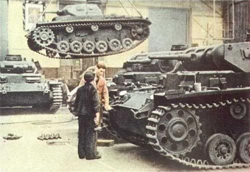
As far as the second quote, I have to disagree. My point was abouttaking pictures in the factories where the equipment was being built and tested. Until the '45 those sites would have been away from the front - granted the Allies were trying to bomb the crap out of them. but you get my point.
What I meant about my second point was that many of the cool camo schemes weren’t to be seen until AFTER the AFV left the factory and had field-applied camo/whitewash, etc. applied…
Those pics are cool…very unusual to see a Marder IIIM in what appears to be panzer grey as these weren’t produced until after Feb '43…is that a dark green? The point brought up earlier about the colors being “cartoonish” is also evident—they are very rich. The Marder drives the point home in that even in color, it is hard to tell what color it is!!!
Notice the dust on the panzer grey turning the vehicles a khaki/ochre color—this is exactly why the Germans adopted yellow ochre as the new base color in Feb '43…
LOL…I actually have a collection of WW2 color shots but just like these, they just don’t “look right” as far as colors go…it looks as though someone painted them in watercolors…I have relied more on B&W pics a lot more than color pics for refs…I mean, that Marder is a perfect example: What in the heck color is that???
A little off topic however, keep in mind that a color picture displayed on a computer screen will appear different from computer to computer. The reason for this is brightness, color settings (or warmth) and contrast. For instance a camo Panzer might appear lighter Dungelgelb on your computer but darker on someone elses.
looking at the pics on line really isn’t what I was getting at anyhow. I was just wondering why we don’t see more color in the references that have been are will be published. Honestly, I still wonder. There would seem to be enough unique pics out there to be had. Besides, think of the controversy you could generate and the book sales that could result…
By the way, on my monitor at work the marder III is a perfect panzer gray. At home, it’s kind of a cadavor gray.
Anyhow, I thought I would post a Marder II to keep the III company
BTW, I dont think the factory pic is a B/W that has been colored. I tihnk it is a color pic that either hasn’t survived the test of time well or was developed “poorly.”