One of my very favorite box art pieces, by John Steel.

I liked it so much, I built it.

One of my very favorite box art pieces, by John Steel.
I liked it so much, I built it.
Thats a nice looking oiler.
I’m doing an oiler for a friend that served on the Mattaponi AO41. The kit I’m using is a Lindberg repop, 1/525. It’s a fairly crude kit. The kit is actually a Kennebec class oiler, a T-2 type and the Mattaponi was the first of her class, a T-2A. She was 20 feet longer, but basically the same otherwise, but it’s taking a bit of work to make it the Mattaponi.
What kit was yours built up from?
EJ
I kind of like it…
yes-no.
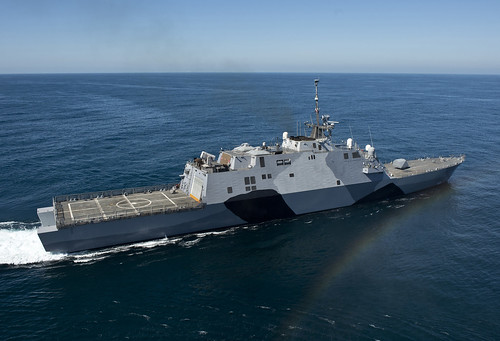
The Burke looks best in gray, IMO.
The oiler model is the Revell San Juan Capistrano. I made a lot of revisions.
A couple of points of clarification/correction. Disruptive schemes were used in the US Navy until 1945 as German and Japanese submarines were considered more of a threat (it was harder to guard against them than aircraft that could be picked up on radar) until the Kamikaze was used starting in late 1944.
“The overall dark scheme” were more effective against aircraft" while technically true in many cases is missing a bunch of information. The most effective scheme for hiding a ship is one that matches the background. If the plane is high and looking down on the ship and the ocean, a dark tone is going to best hide the ship.
If, however, the attacker is low and searching against a light sky, a dark paint is going to stand out. The US Navy stopped using black paint on the masts of ships and as shadows in the hull numbers in the late 1980s/early 1990s because optically-guided surface skimming cruise missiles were able to use the high contrast of that paint to target the ship.
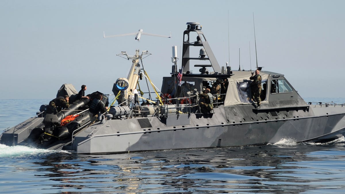
It’s technically a “two-off” scheme as two of the LCSs are painted in a dazzle scheme. And yes, it is primarily to hide the soot stains from the diesel generators aboard - while both ships have different patterns, you can see that the black sections are in nearly the same location on both and extend aft from the exhaust ports. LCS-1 Freedom’s captain sold it as a maintenance and crew moral effort and during an interview stated that he and the ship’s XO looked at some old photos of ships or design sheets for inspiration when they laid it out. If you look at them, they do a bad job at breaking up the ships’ outlines or obfuscating direction and speed.
As far as the colors being green and/or gray, the Navy learned in WWII that it wasn’t the color that mattered in camouflage as much as tone. If you think about how many modelers discuss “Scale effect” and how the colors mute out with distance, this is essentially the same thing. Close up, color can matter, but as you put more air and moisture between a subject and the viewer, the vibrancy fades and you merely need to match against a light sky or a dark ocean. Gray can also be good at taking on hues from surrounding sources and can adapt somewhat.
Mr. White, extremely good to hear from you here.
“Tone” is also referred to as “value”. It’s the way we see the apparency of an object, as a quality that bridges colors. The most common way to evaluate value is to squint at the object. Which is of course the method most used before radar.
Remember Mountbatten Pink? The value of that color was about the same as Haze Gray. Or Ocean Gray. Generally hard to make out at a distance.
Last thought- a lot of color on ships with hull overhang, like aircraft carriers; reflected light off of the surface of the sea.
Is tone or value the same as hue? I seem to remember color measurement as hue-saturation-brightness.

http://www.workwithcolor.com/color-properties-definitions-0101.htm
Hue is the pure color, whether one of the primary (Red, Yellow, Blue) or secondary colors which are mixtures of various proportions of the primary (Orange, Red-Orange, Yellow-Orange, etc.)
Tone is the percentage mixture of the pure color with neutral gray. This results in a ‘muddying’ of the pure color. You could also take the brick-red above and tone it out toward gray
Saturation defines a range from pure color (100%) to gray (0%) at a constant lightness level. A pure color is fully saturated.
value is likened to brightness (or lightness)
GM, thanks for the explanation about color. I had wondered about the Mountbatten Pink in the past, and your explanation makes perfect sense.
To Mr.White, yes I did leave out a lot of detail on my post regarding the switch from the dazzle schemes to the overall dark schemes due to the kamikaze threat in 1945. I try to keep my posts brief and to the point. I do more than enough writing on a daily basis that I do not particularly wish to do for my day job. But thank you for the explanation on the LCS scheme. I’m sure that you can understand how a non Navy type like myself can easily get led astray by seeing photos of other contemporary USN inshore craft in a similar scheme, and reach my own conclusions, however off target they may be.
Know the feeling.
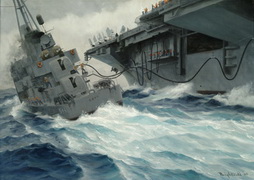
I’ve been around the fullsize lithograph of this as long as I can remember.
My dad was on DD-544 USS Boyd when the artist was. So, he got a signed artist’s proof. Which hung in is work office, and now hangs in his home office.
The same artist did a painting of (what was then) DesRon 34 rafted up nest to USS Prairie AD-15 in San Diego bay.
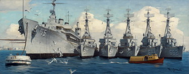
Which would need finding a Dixie class AD.
CapnMac82 ;
hey ! are you trying to take me down memory lane ? Well you did a good job , there . I remember there being a contest of sorts .We always got the Piedmont . She claimed the " Best Ice Cream Machine in the Fleet . Based on the lines I kinda thought it was true .Shoot , I was in them enough !
Now the " Unrep Print ". Picture that with a top heavy Fram Gearing ! Whereas I would be as Leading Damage Control Petty Officer , On the Bridge , Hold on Boys ! ! Interesting times , those ! T.B. P.S. After my Inter-Service transfer to the Corps , I would watch these Maneuvers from the Midway ! Whatta Difference . My heart went out to every one of those guys ! .
Suggest revise the caption to read DD-544 USS Boyd.
Very nice paintings for sure.
Those ADs have such long deckhouse/ galleries/ boatdecks. They almost look like a small cruise ship (doubtful) or a floating Motel 6.
Well;
I never thought about them that way . You are right though . I always thought they were older cruise ship conversions the Navy just kept after the war . It is amazing how many shops they stuffed in them though .
Plus the reefer and grocery area ! Holy Cow ! Like a Super Market backroom ! But those guys and now ladies too , have great living spaces compared to a fighting ship .
A lot of our deck guys had an almost violent jealousy of them for that , A Gearing was stuffed , even more so after FRAM ! But they even disliked us Snipes because we berthed aft .The space was larger !
They didn’t get to experience the shaking and thrumming from the screws and the hydraulic sounds from after steering though ! It was all good though . T.B. P.S. Thing is , sometimes the Dixie , after a Wes-pac cruise looked like a light Blue-Grey after getting her paint in order .