I remember my first WestPac tour aboard the USS Coral Sea we pulled into Hong Kong for six days of liberty and ship painting. A crew of women, seemed like hundreds, decended upon us and painted the ship inside and out using 5 gallon buckets and rags as paint brushes. Unless someone knows different we paid them with brass.

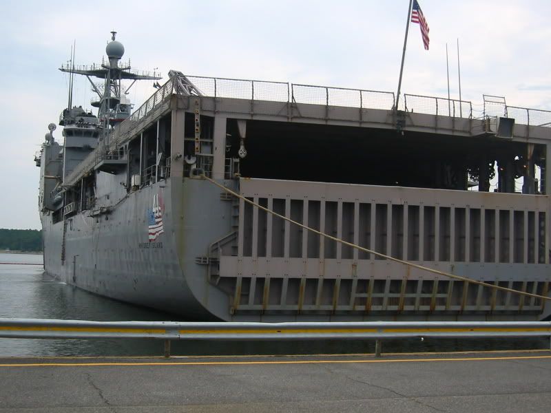
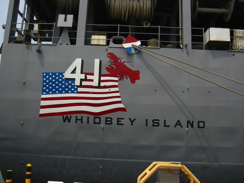
At the IPMS Nats last week I went on the tour of the USS Whidbey Island at the amphib base. The ship was just back from operations off of Somalia. Local paint and hot water (according to the tour guide) combined to give a slight pink tinge to the haze gray. See the color gradation s on the stern gate.
The ship returned to Virginia by way of a maritime festival in Maine, that is the significance of the lobster on the stern-art.

The ship was being primed overall for a thorough yard-period paint job.
John,
I vividly remember that discussion. There were in fact three English Galleon kits in that series; the Ark Royal, Henry Grace a Dieu, and Revenge. The Ark Royal was absolutely horrible!
EdGrune . . . those were terrific pictures of the USS Whidbey Island. I don’t think that I would want to try that pink tinge though!
Bill Morrison
My [2c], with my ever-expanding collection of shades of gray - For me, close enough is good enough, unless it is something totally offbeat that I don’t have anything close to, such as the 5-L Light Gray going on my current APA Haskell build (that purplish-blue tint looks very, very odd on a warship).
When I was starting my IJN Kimikawa Maru build, I pondered getting some Kure Arsenal Gray to get the exact match, but didn’t. Two reasons: 1) Cost, for a shade I would probably never use again, and 2) Model Master Dark Gull Gray looked pretty close to me. After six months of getting the crap knocked outta her all over the North Pacific, I doubt the Kimikawa Maru looked even remotely factory fresh anyway.
MFSOB’s observation about the WWII “purple blue” camouflage colors may well have something to do with my earlier point about lighting. Camouflage schemes, at least from WWII onward, have been designed, by extremely smart people who know what they’re doing, to be effective in sunlight (which, after all, is the only kind of light in which a ship, airplane, or military vehicle is normally seen by the enemy). Take a piece of metal painted that same color inside and point an incandescent or flourescent light at it, and it will look different.
A couple of weeks ago I had the pleasure of going to the IPMS Nationals in Virginia Beach. All the models were displayed in a huge hall lit by flourescent tubes high up on the ceiling. (I’m sure the organizers of the event - who, from what I could tell, did a superb job of it - had no control over the lighting.) It was, of course, an extremely impressive exhibition; some of the models there were among the best I’ve ever seen. But I confess I found myself thinking that they would have looked even better under some other kind of light.
Hey, guys. Enough reminiscing about the good ol’ days when you could actually get your moneys worth at the hobby store. I think I’m gonna get me a beer and sit in the corner and have a good cry ! Darn it I miss it !
I wish I had read JTilley’s post BEFORE I did my USS Arizona!!! I was getting too anal about “color” and “correct shades” and a quick read through his post basically told me “It’s ok…Don’t obsess over the 15 thousand minute shades of gray/grey that that end up on theses ships!!!” Cool read!!!