Heller Le Glorieux and Le Superbe

Hello: Regarding Heller its ratlines/shrouds. I am in the process of completing Heller its Le Saint Louis (btw: it is actually the La Courone).

I haven’t done it for myself yet, but I stumbled across the following clever method: if you do not want to tie knots one modeler claims the following method will work: You might use “Pattex” spray glue (Pattex is very common in Europe) and mix/stir it up with paint solver. In turn you can use an ordinary brush for applying the thinned Pattex glue over the layed out lines and that will give you a good bond without knots. Propably you will have to repeat applying the Pattex layer 2 or 3 times.

Regards,
Kater Felix

Nelson checker is not in keeping with that period. The pattern of thick alternating black and light bands on hull sides found in Nelson checker were not very common until 1800, and the black gun port lids that actually completes the checker pattern was Nelson’s personal invention. Previously, Ships tended to be painted black to about the tops of the lowest wales, and yellow or another color all the way to the bulwurks, sometimes with thin bands to pick out the individual wales.

http://www.rd-maquettes.com/index.php?page=44&lg=1

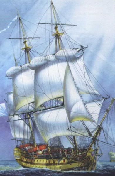
Hmmm…This is what I refering too…The way Heller box’s them.

Would this not be close to how ‘Nelson’ had his ships done?

Jeff

That picture doesn’t show up very big on my monitor, but in general I find it pretty believable.

The “Nelson checker” scheme (which, so far as I know, never was given that name officially) consisted of a yellow (or, more correctly, yellow ochre) stripe running through each row of gunports, with the rest of the above-water hull painted black. If the current paint job on the Victory is to be believed (as I think it is), the yellow stripes didn’t follow the lines formed by the tops and bottoms of the gunports, but rather tapered noticeably at each end. (There’s a good discussion of this point on the Victory’s website.) The exteriors of the gunport lids were painted black, resulting in the “checkerboard” effect whether the ports were open or closed.

Prior to that period, the sides of the typical sailing warship (there were plenty of exceptions) were either painted yellow ochre or simply treated with some sort of oil, which, according to the paintings of the period, produced a rather similar color when it was fresh and darkened as it got older. (It’s been suggested that the oil eventually turned almost black, resulting in a ship with an overall black hull.) The exteriors of bulwarks above the upper gundeck sometimes were painted blue and sometimes black, with the latter becoming more popular as time went on. And the wales - the bands of thick planking below and between the rows of gunports - often were either painted black or coated with tar as a preservative.

It looks to me like the person responsible for that Heller boxtop painting was trying to reproduce the latter scheme. On my monitor the yellow looks overly bright, but there’s room for artistic license there. It looks to me like we’re looking at a yellow hull with black wales - not a black hull with yellow stripes. (Note that the yellow areas are considerably broader than the gunports are tall.) And the exteriors of the portlids appear to be yellow, not black. (I gather the upper ports don’t have lids. That’s believable.)

It’s important to remember that, though the governing bodies of navies sometimes issued orders regarding the painting of specific items (which orders may or may not have been obeyed all the time), the painting of warships in general was nowhere near as standardized in the eighteenth century as we’ve come to take for granted in more recent times.

It looks to me like the painting on that box top is at least as good as the contents. And the artist who painted the picture understood rigging - which is more than can be said for whoever was responsible for the instructions.

It is similar to what would have been on many of Nelson’s ships. But by in keeping with the period, I thought you meant the early 18th century when the capture of this ship occurred, not the early 19th century, when Nelson checker was in vogue.

There doesn’t seem to be a huge amount of direct evidence to show that Nelson checker was popular outside the RN during Nelson’s life. For example, some of the French ships in Trafalgar was said to be painted in alternating red and black bands, others white and black bands. Some of the Spanish ships were said to be painted all black, and others, noticeably the gigantic Santissima Trinidad, the largest and most imposing ship at Trafalgar, were described by the British as wearing a red, white and black stripes pattern, but with thick red and black bands outlined in thin white pin stripes. So it is not together clear to me whether a French ship of very early 1800s should wear the traditional Yellow and black or white and black Nelson checker.

The British seems to have been more consistent in the approximate color of their ships at that time, using mostly various shades of black and yellow. But there were still a great deal of variation in how the two colors were applied, often at the discresion of the captain. It was more typical to have lower hull painted all black up to the bottom of the lowest roll of gun ports, and the yellow from there all the way to the bulwurks. It was to help identify British ship from foreign that the British Mediterranean fleet decided to add a solid black band between rolls of gun ports.

When some of the French ships also startedd using a solid black band between gun rolls, Nelson ordered the gun port lids painted black, and the hitherto black mast bands painted yellow as additional identification aid. From this we got the Nelson checker.

Hello: If not already posted the following link will show the completed Glorieux and Le Superbe (simply by clicking on the pertinent name):

http://www.modelarstwo.org.pl/_OLD/szkutnicze/zaglowce/spis-plastik.html

The box art are always a bit different than what might be adviced in the instructions. For example my Le saint Louis box-art is also different than what might be expected from the color scheme given in the instructions.

Regards,
Kater Felix

Hi,

Here are some photos of dry-fitted hull of my Le Superbe:

  1. Front view. Notice the wood grain detail of hull sides – very nice, but, unfortunately, without planks.

  1. Stern galery. This part is different from Le Glorieux.

  1. Decks.

Stefan.

Looking at the unpainted photos, I believe it to be entirely possible to scribe planks onto the hull. We’re not really talking about a lot of area. Plus, It looks like a pretty fine kit otherwise. Stefan, post some pics as you go.

Grymm

I have built both Glorieaux and Superbe in the past, and considering what else is out there in plastic sailing ships, they are way up by the top! While I know the ‘woodgrain’ effect bulwarks look odd without planking lines, it does lend itself very well to painting to look like wood! Most of the French ships of the period were reportedly either painted a sort of maroon along the gunport strakes (with black or dark brown for the wales), or were finished ‘bright’ (i.e. oiled wood otherwise unfinished) with black or brown wales. I used a quite light yellow in enamel on the strakes first, then applied a wash of thinned brown acrylic over it to get a very acceptable reddish wood tone that looks very much like oiled wood. While I have thought few plank lines would improve things perhaps, but at this scale, any such lines would either be way overdone in the castings, or if to scale, would be so fine as to be simply filled in by most paint…

In addition, French (and Spanish, for that matter) ships often carried this light (either brightwork, or light paint) color to the upper works as well (almost invariably painted black for British ships), at least until 18about 1805, which in the case of a 74, or 80 gun ship, presents the appearance of what might best be described as a ‘two and a half decker.’ There were even several large French, Spanish, and even British warships that were painted all black (just to confuse things further!), at least one Spanish ship painted entirely yellow (the ‘Rayo’), not to mention a few frigates that were painted gray (the HMS Shannon). I have also seen examples of what can only be called a sort of camoflage, by leaving just the upper gundeck strakes in ‘bright,’ while the black of the mainstrake (often just referred to as ‘the black strake’) is carried up to the bottom of the uppder gundeck, thus concealing the existence of the lowerdeck guns and perhaps mistakable as a frigate in the distance!

Given the quite different appearance in the decorations for both Glorieaux and Superbe (both were built to a standard Sane’ 74 hull design that was in use by the French for about 25 years, and even a couple British ships were built as copies, I am surprised there are not more ‘kit-basher’ modifications to represent other ships), it appears to me that Glorieaux has many of the decorative features of a slightly earlier era than ‘Superbe’, say about 1760-ish and is more British than French(very similar to decorative work of the ‘Courageaux,’ after taken into British Service and modified). As a result, I opted to paint ‘Glorieaux’ in British buff yellow and black, with a lot of bright reds, blues and whites on the sternworks (similar to that of the ‘Leopard’ shown on the cover art of the book ‘The 50 Gun Ship’). ‘Superbe’ in contrast is a much more sober ship, much more in keeping with French revolutionary vessels decor. For this, I went with a more tan wood tone for the gundeck strakes, black for the wales, and dark blue and black for many of the stern features, similar to that featured in Pocock paintings of the sinking ‘Vengeur’ at the Glorious First of June battle, plus a dark blue strake just below the rail of the poopdeck on the quarters, repeated on the fo’c’sle. Never did figure out how to replace the awful figurehead, so just painted the one that came with the kit with gold and blue…

If you look at HMS Victory as she sits in Portsmouth today, you’d find the surface of the planks are plained to a very smooth finish and planking lines are extremely subtle, almost invisible. Only a very subtle change in the curvature of the tumblehome reveals where one strake of planking ends and another begins.

The Victory is a tremendously valuable guide to scholars and modelers - one of the most valuable historical artifacts in existence. But she’s not a 100% reliable guide to the more subtle aspects of the appearance of real sailing ships.

She’s been replanked several times since the end of her active service, and the unfortunate realities of money and available materials have forced some big compromises with reality. Another concern of the preservationists is their desire to keep her basic structural fabric as intact as possible. Her lower masts, for instance, are steel tubes, and are not stepped on the keelson; iron rods welded to the masts go through the hull planking on either side of the keel and are imbedded in the concrete of the drydock. (That’s an extremely intelligent solution to the problems that would otherwise result from the huge forces of the rigging bearing on the keel assembly.) As I understand it, the wales on her sides are formed by relatively thin layers of wood fastened to the exterior of the hull planking. (The originals, of course, were huge pieces of timber - of the sort that would be prohibitively expensive today - fastened directly to the frames, with the “common plank” laid between them.) The pieces of the original wales were shaped in the “anchor stock” pattern; the current ones - unless they’ve been changed since the last time I saw her, which admittedly was quite a few years ago - are not. The reconstructed parts of the ship are full of compromises like that. Virtually all preserved and replica ships operate that way; the people who run them quickly discover that there just isn’t any choice.

In the eighteenth and nineteenth centuries the usual way to plank a ship’s hull (and deck, for that matter) was to bevel the edges of the planks, deliberately leaving a gap of an inch or so (maybe a bit less) between them on the exterior surface. After the planks had been laid, the caulker - a highly trained specialist, probably with several apprentices helping him - forced his caulking material (usually a mixture of old rope, oakum, and tar, kept heated in a pot) into the gap. The result was that the joints between the planks, especially in an unpainted hull, were in fact quite conspicuous. (Nineteenth-century photographs of ships on the launching ways often show the hull planking seams quite clearly, even when reproduced pretty small.) A coat of paint, of course, would make the seams much less conspicous. Whether the caulking would protrude slightly above the surface or be recessed slightly below it is an interesting question. I guess that may have varied, depending on how old the caulking job was, how the ship was working - and even the temperature, which might, I suppose, make the caulking swell a little.

How the planking seams ought to be represented on a model is, in my firm opinion, one of the many decisions that need to be left to the individual modeler. Model aircraft enthusiasts confront a similar problem. The grooves marking the edges of “metal panels” on even the finest Tamiya and Hasegawa 1/72-scale aircraft kits are, strictly speaking, grossly out of scale. If they were enlarged to full size the mechanics would be in danger of tripping over them.

My personal opinion is that, except on extremely small scales (smaller than 1/16"=1’), a hull with no visible planking seams doesn’t look right. (Many of the best, and most well-known, ship modelers seem to agree with me. Donald McNarry, who, if I were forced to bestow such titles, probably would get my vote for the title best ship modeler in the world, painstakingly mounts individual planks on models as small as 1/600 scale.) But to each his (or her) own. I’ve seen some mighty handsome and well-detailed models with no planking seams.

My bigger complaint with those two Heller ships of the line concerns the lack of deck camber. Their decks are perfectly flat - a mistake that’s pretty hard to excuse and harder to fix.
Here is a superb article about the Téméraire class 74 gunners to which heller’s Superbe belongs. A full list of her 106 sisterships are also given:

http://fr.wikipedia.org/wiki/T%C3%A9m%C3%A9raire_%28bateau%29

As I mentioned in another post, I’ve recently bought the Le Superbe kit and am very impressed by its level of detail and fine moulding, apart from the overscale wood grain mentioned by other posters. I also have all the alternate parts for Glorieux in my spares box.
I have had thoughts of converting the kit to represent a captured French ship in the Royal Navy, possibly HMS Implacable - which, as far as I know, was a ship of the same design as the Superbe - the Duguay Trouin) whose stern gallery is displayed in the Greenwich Maritime Museum. I’m thinking that using the transom moulding from Superbe (plainer in appearance and fairly close to that of Implacable from what I remember) and a different figurehead would be a start. Anyone know what figurehead Implacable had? The one from Heller’s Glorieux kit is a crowned lion’s head which looks similar to that used on some RN ships in the late 18th century. (Alternatively a simple billet- or fiddle-head would be fairly easy to carve).

Is this conversion a practical idea, or not? Would any changes to the deck furniture, rigging, armament etc. be needed to represent a captured RN “74” (not necessarily the Implacable)?

EPinniger, where did you find your Superbe kit? I have been looking for this kit for some time and can’t find it anywhere except perhaps on Ebay. I would imagine that it is more available in Europe, but like you I can’t afford the shipping for most kits from the UK, France or Germany. I drastically overpaid for the Susquehanna kit I bought on eBay from a gentleman in Britain, but that was a kit I absolutely had to have.

It seems that Heller kits, and especially the sailing ship kits, are extremely hard to find in the US, and when you can find them anywhere the shipping costs are quite high. Since most postage is charged by weight and not by size, charging $20 or more for shipping seems like gouging. I was able to find the 1/200 Royal Louis and will probably work on that at some point, but would like to do a 74 in a larger size before I tackle a three-decker in a smaller scale.

I live in the UK and Airfix, Heller, Revell Germany and Eastern European/Russian kits are plentiful here. I bought the Superbe on eBay from a UK seller and paid about £25 including shipping. I think it is still in production, or at least still available at retail, and costs about £30-35.
I have your problem in reverse, though - Lindberg, Pyro, Monogram, Aurora and Revell US kits (those that haven’t been issued by Revell Germany) are hard to find here, and when the kits are out of production and rare in the first place, it makes finding them a tricky job. I usually buy them on eBay US but the shipping costs are often prohibitive.

The Superbe kit is a big box however, and quite heavy; I’m not surprised it costs about $20 to ship across the Atlantic via air-mail. I do a lot of selling on eBay as well as buying, and many of my items are bought by overseas buyers, so am fairly familiar with shipping costs.

I have noticed quite a few Heller sailing ship kits when browsing eBay US in the past, so if you’re patient you might find a Superbe or Glorieux. I definitely recommend either of these kits if you’re interested in sailing warships of this period - other than the wood grain and deck grain problems they’re among the best available.

EP –

The figurehead of the Implacable is at the NMM in Greenwich along with the stern gallery. I found a picture on the NMM website:

Figurehead of the HMS Implacable

Here’s the link… the NMM websire has another b/w picture of the figurehead from a different angle. http://www.nmm.ac.uk/server/show/conWebDoc.219